Build AI Agents
The Agent SDK allows you to create powerful, conversational apps directly inside Athena AI.
Why build AI Agents?
Proactive co-marketing
We will advertise your agent to our newsletter of 300,000+ users, giving you instant exposure to a dedicated audience.
Discoverable by 3M+ users
Your agents will be searchable and usable by over 3 million users on both Athena Chat and Athena Board.
We pay for installs
Get compensated as your agent grows in popularity:
| 1,000 installs | $200 |
| 2,000 installs | $500 |
| 5,000 installs | $1,500 |
| 10,000 installs | $3,500 |
Simple to integrate
Built on standard protocols. If you already have a MCP (Model Context Protocol) server for ChatGPT apps, it will work seamlessly with Athena AI.
Advantage over ChatGPT App SDK
-
Embeddable anywhere: Run your agent on your own website, not just inside our platform.
-
Athena Board integration: Interactive collaborative whiteboard support in addition to the standard chat interface.
-
Monetization: Clear compensation model and extensive co-marketing support to help you grow.
-
Upsell opportunities: We allow and encourage you to upsell your own software products within your agent.
-
Co-advertising on TAAFT: Get featured on the front page of theresanaiforthat.com, the most popular AI directory.
-
Onboarding supports: We will help you to build the most interesting integration.
Quickstart
Introduction
The Apps SDK relies on the Model Context Protocol (MCP) to expose your app to Athena AI. To build an app for Athena with the Apps SDK, you will need two things:
- A web component built with the framework of your choice – you are free to build your app as you see fit, that will be rendered in an iframe in the Athena interface.
- A Model Context Protocol (MCP) server that will be used to expose your app and define your app's capabilities (tools) to Athena.
In this quickstart, we'll build a simple to-do list app, contained in a single HTML file that keeps the markup, CSS, and JavaScript together.
To see more advanced examples using React, see the examples repository on GitHub.
Build a web component
Let's start by creating a file called public/todo-widget.html in a new directory that will be
the UI rendered by the Apps SDK in Athena.
This file will contain the web component that will be rendered in the Athena interface.
Add the following content:
<!DOCTYPE html>
<html lang="en">
  <head>
    <meta charset="utf-8" />
    <title>Todo list</title>
    <style>
      :root {
        color: #0b0b0f;
        font-family: "Inter", system-ui, -apple-system, sans-serif;
      }

      html, body { width: 100%; min-height: 100%; box-sizing: border-box; }
      body { margin: 0; padding: 16px; background: #f6f8fb; }
      main { width: 100%; max-width: 360px; min-height: 260px; margin: 0 auto; background: #fff; border-radius: 16px; padding: 20px; box-shadow: 0 12px 24px rgba(15, 23, 42, 0.08); }
      h2 { margin: 0 0 16px; font-size: 1.25rem; }
      form { display: flex; gap: 8px; margin-bottom: 16px; }
      form input { flex: 1; padding: 10px 12px; border-radius: 10px; border: 1px solid #cad3e0; font-size: 0.95rem; }
      form button { border: none; border-radius: 10px; background: #111bf5; color: white; font-weight: 600; padding: 0 16px; cursor: pointer; }
      input[type="checkbox"] { accent-color: #111bf5; }
      ul { list-style: none; padding: 0; margin: 0; display: flex; flex-direction: column; gap: 8px; }
      li { background: #f2f4fb; border-radius: 12px; padding: 10px 14px; display: flex; align-items: center; gap: 10px; }
      li span { flex: 1; }
      li[data-completed="true"] span { text-decoration: line-through; color: #6c768a; }
    </style>
  </head>
  <body>
    <main>
      <h2>Todo list</h2>
      <form id="add-form" autocomplete="off">
        <input id="todo-input" name="title" placeholder="Add a task" />
        <button type="submit">Add</button>
      </form>
      <ul id="todo-list"></ul>
    </main>

    <script type="module">
      const listEl = document.querySelector("#todo-list");
      const formEl = document.querySelector("#add-form");
      const inputEl = document.querySelector("#todo-input");

      let tasks = [...(window.openai?.toolOutput?.tasks ?? [])];

      const render = () => {
        listEl.innerHTML = "";
        tasks.forEach((task) => {
          const li = document.createElement("li");
          li.dataset.id = task.id;
          li.dataset.completed = String(Boolean(task.completed));

          const label = document.createElement("label");
          label.style.display = "flex";
          label.style.alignItems = "center";
          label.style.gap = "10px";

          const checkbox = document.createElement("input");
          checkbox.type = "checkbox";
          checkbox.checked = Boolean(task.completed);

          const span = document.createElement("span");
          span.textContent = task.title;

          label.appendChild(checkbox);
          label.appendChild(span);
          li.appendChild(label);
          listEl.appendChild(li);
        });
      };

      const updateFromResponse = (response) => {
        if (response?.structuredContent?.tasks) {
          tasks = response.structuredContent.tasks;
          render();
        }
      };

      const handleSetGlobals = (event) => {
        const globals = event.detail?.globals;
        if (!globals?.toolOutput?.tasks) return;
        tasks = globals.toolOutput.tasks;
        render();
      };

      window.addEventListener("openai:set_globals", handleSetGlobals, { passive: true });

      const mutateTasksLocally = (name, payload) => {
        if (name === "add_todo") {
          tasks = [...tasks, { id: crypto.randomUUID(), title: payload.title, completed: false }];
        }
        if (name === "complete_todo") {
          tasks = tasks.map((task) => task.id === payload.id ? { ...task, completed: true } : task);
        }
        if (name === "set_completed") {
          tasks = tasks.map((task) => task.id === payload.id ? { ...task, completed: payload.completed } : task);
        }
        render();
      };

      const callTodoTool = async (name, payload) => {
        if (window.openai?.callTool) {
          const response = await window.openai.callTool(name, payload);
          updateFromResponse(response);
          return;
        }
        mutateTasksLocally(name, payload);
      };

      formEl.addEventListener("submit", async (event) => {
        event.preventDefault();
        const title = inputEl.value.trim();
        if (!title) return;
        await callTodoTool("add_todo", { title });
        inputEl.value = "";
      });

      listEl.addEventListener("change", async (event) => {
        const checkbox = event.target;
        if (!checkbox.matches('input[type="checkbox"]')) return;
        const id = checkbox.closest("li")?.dataset.id;
        if (!id) return;

        if (!checkbox.checked) {
          if (window.openai?.callTool) {
            checkbox.checked = true;
            return;
          }
          mutateTasksLocally("set_completed", { id, completed: false });
          return;
        }
        await callTodoTool("complete_todo", { id });
      });

      render();
    </script>
  </body>
</html>
Using the Apps SDK in your web component
window.openai is the bridge between your frontend and Athena.
When Athena loads the iframe, it injects the latest tool response into window.openai.toolOutput,
which is an object specific to the Apps SDK. Subsequent calls to window.openai.callTool return
fresh structured content so the UI stays in sync.
Build an MCP server
Install the official Python or Node MCP SDK to create a server and expose a /mcp endpoint.
In this quickstart, we'll use the Node SDK.
If you're using Python, refer to our examples repository on GitHub to see an example MCP server with the Python SDK.
Install the Node SDK and Zod with:
npm install @modelcontextprotocol/sdk zodMCP server with Apps SDK resources
Register a resource for your component bundle and the tools the model can call (e.g. add_todo
and complete_todo) so Athena can drive the UI.
Create a file named server.js and paste the following example that uses the Node SDK:
import { McpServer } from "@modelcontextprotocol/sdk/server/mcp.js";
import { StreamableHTTPServerTransport } from "@modelcontextprotocol/sdk/server/streamable-http.js";
import { createServer } from "node:http";
import { readFileSync } from "node:fs";
import { z } from "zod";

const todoHtml = readFileSync("public/todo-widget.html", "utf8");

const addTodoInputSchema = { title: z.string().min(1) };
const completeTodoInputSchema = { id: z.string().min(1) };

let todos = [];
let nextId = 1;

const replyWithTodos = (message) => ({
  content: message ? [{ type: "text", text: message }] : [],
  structuredContent: { tasks: todos },
});

function createTodoServer() {
  const server = new McpServer({ name: "todo-app", version: "0.1.0" });

  server.registerResource(
    "todo-widget",
    "ui://widget/todo.html",
    {},
    async () => ({
      contents: [{
        uri: "ui://widget/todo.html",
        mimeType: "text/html+skybridge",
        text: todoHtml,
        _meta: { "openai/widgetPrefersBorder": true },
      }],
    })
  );

  server.registerTool(
    "add_todo",
    {
      title: "Add todo",
      description: "Creates a todo item with the given title.",
      inputSchema: addTodoInputSchema,
      _meta: {
        "openai/outputTemplate": "ui://widget/todo.html",
        "openai/toolInvocation/invoking": "Adding todo",
        "openai/toolInvocation/invoked": "Added todo",
      },
    },
    async (args) => {
      const title = args?.title?.trim?.() ?? "";
      if (!title) return replyWithTodos("Missing title.");
      const todo = { id: `todo-${nextId++}`, title, completed: false };
      todos = [...todos, todo];
      return replyWithTodos(`Added "${todo.title}".`);
    }
  );

  server.registerTool(
    "complete_todo",
    {
      title: "Complete todo",
      description: "Marks a todo as done by id.",
      inputSchema: completeTodoInputSchema,
      _meta: {
        "openai/outputTemplate": "ui://widget/todo.html",
        "openai/toolInvocation/invoking": "Completing todo",
        "openai/toolInvocation/invoked": "Completed todo",
      },
    },
    async (args) => {
      const id = args?.id;
      if (!id) return replyWithTodos("Missing todo id.");
      const todo = todos.find((task) => task.id === id);
      if (!todo) return replyWithTodos(`Todo ${id} was not found.`);
      todos = todos.map((task) => task.id === id ? { ...task, completed: true } : task);
      return replyWithTodos(`Completed "${todo.title}".`);
    }
  );
  return server;
}

const port = Number(process.env.PORT ?? 8787);
const MCP_PATH = "/mcp";

const httpServer = createServer(async (req, res) => {
  if (!req.url) { res.writeHead(400).end("Missing URL"); return; }
  const url = new URL(req.url, `http://${req.headers.host ?? "localhost"}`);

  if (req.method === "OPTIONS" && url.pathname === MCP_PATH) {
    res.writeHead(204, {
      "Access-Control-Allow-Origin": "*",
      "Access-Control-Allow-Methods": "POST, GET, OPTIONS",
      "Access-Control-Allow-Headers": "content-type, mcp-session-id",
      "Access-Control-Expose-Headers": "Mcp-Session-Id",
    });
    res.end();
    return;
  }

  if (req.method === "GET" && url.pathname === "/") {
    res.writeHead(200, { "content-type": "text/plain" }).end("Todo MCP server");
    return;
  }

  const MCP_METHODS = new Set(["POST", "GET", "DELETE"]);
  if (url.pathname === MCP_PATH && req.method && MCP_METHODS.has(req.method)) {
    res.setHeader("Access-Control-Allow-Origin", "*");
    res.setHeader("Access-Control-Expose-Headers", "Mcp-Session-Id");
    const server = createTodoServer();
    const transport = new StreamableHTTPServerTransport({ sessionIdGenerator: undefined, enableJsonResponse: true });
    res.on("close", () => { transport.close(); server.close(); });
    try {
      await server.connect(transport);
      await transport.handleRequest(req, res);
    } catch (error) {
      console.error("Error handling MCP request:", error);
      if (!res.headersSent) res.writeHead(500).end("Internal server error");
    }
    return;
  }
  res.writeHead(404).end("Not Found");
});

httpServer.listen(port, () => {
  console.log(`Todo MCP server listening on http://localhost:${port}${MCP_PATH}`);
});
This snippet also responds to GET / for health checks, handles CORS preflight for
/mcp and nested routes like /mcp/actions, and returns 404 Not Found for
OAuth discovery routes you are not using yet.
Run locally
If you're using a web framework like React, build your component into static assets so the HTML template can
inline them. Usually, you can run a build command such as npm run build to produce a
dist directory with your compiled assets.
In this quickstart, since we're using vanilla HTML, no build step is required.
Start the MCP server on http://localhost:<port>/mcp from the directory that contains
server.js (or server.ts).
Make sure you have "type": "module" in your package.json file:
{
  "type": "module",
  "dependencies": {
    "@modelcontextprotocol/sdk": "^1.20.2",
    "zod": "^3.25.76"
  }
}
Then run the server with the following command:
node server.jsThe server should print Todo MCP server listening on http://localhost:8787/mcp once it is ready.
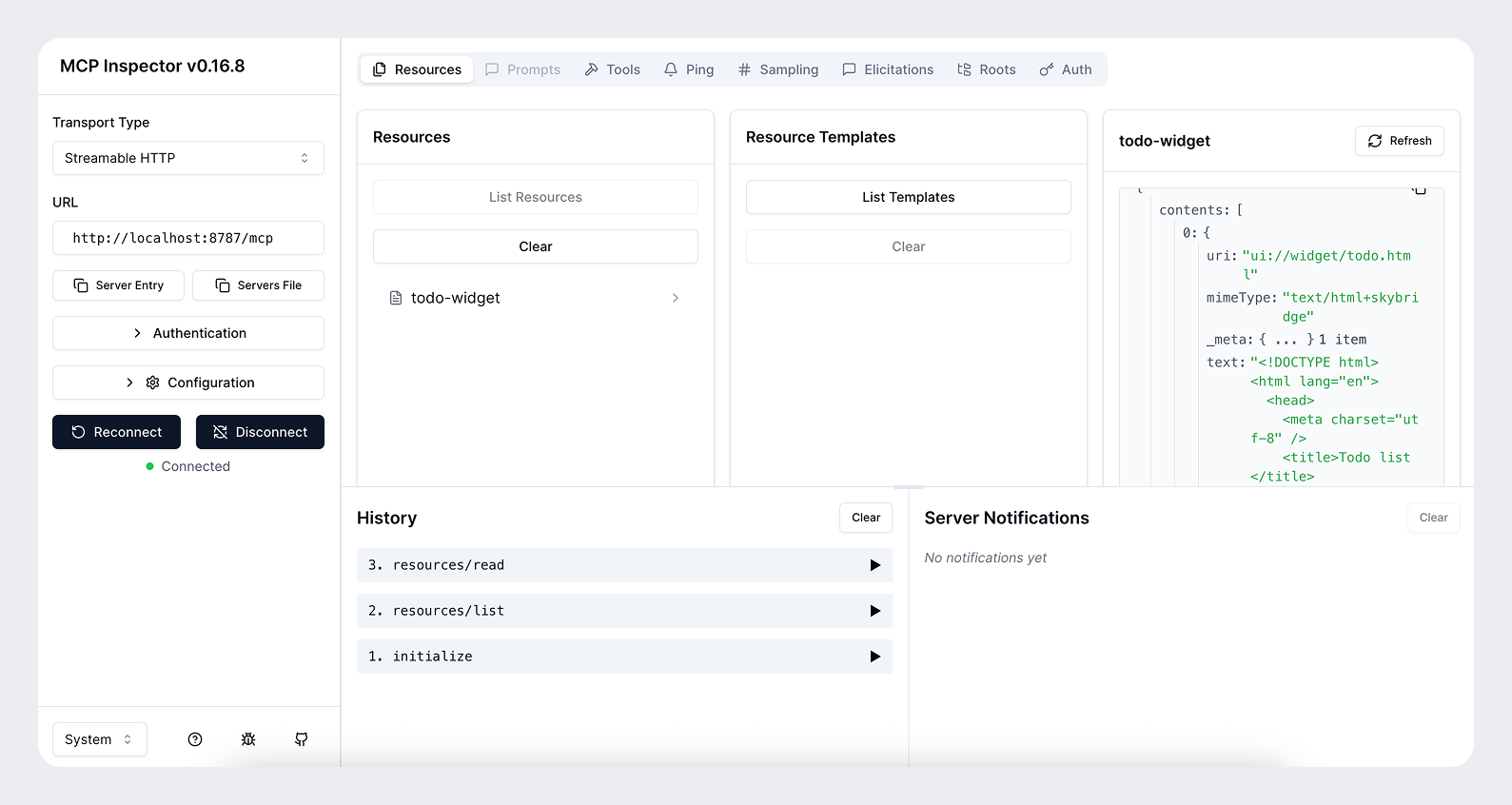
Test with MCP Inspector
You can use the MCP Inspector to test your server locally.
npx @modelcontextprotocol/inspector@latest --server-url http://localhost:8787/mcp --transport httpThis will open a browser window with the MCP Inspector interface. You can use this to test your server and see the tool responses.
Expose your server to the public internet
For Athena to access your server during development, you need to expose it to the public internet. You can use a tool such as ngrok to open a tunnel to your local server.
ngrok http <port>This will give you a public URL like https://<subdomain>.ngrok.app that you can use to
access your server from Athena.
When you add you connector, provide the public URL with the /mcp path (e.g.
https://<subdomain>.ngrok.app/mcp).
Add your app to Athena
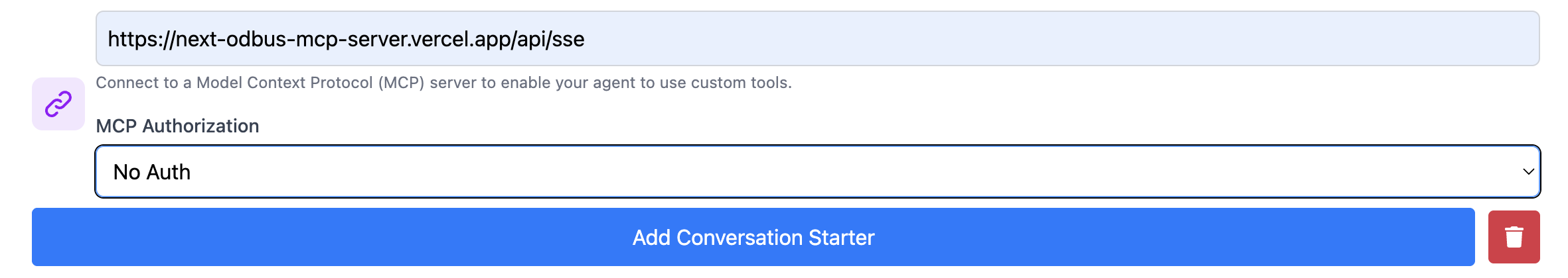
Once you have your MCP server and web component working locally, you can add your app to Athena with the following steps:
- Sign up and Sign in and go to https://athenachat.bot/chatbot/mybots/create
- Fill name, description and prompt. Then, fill the MCP section
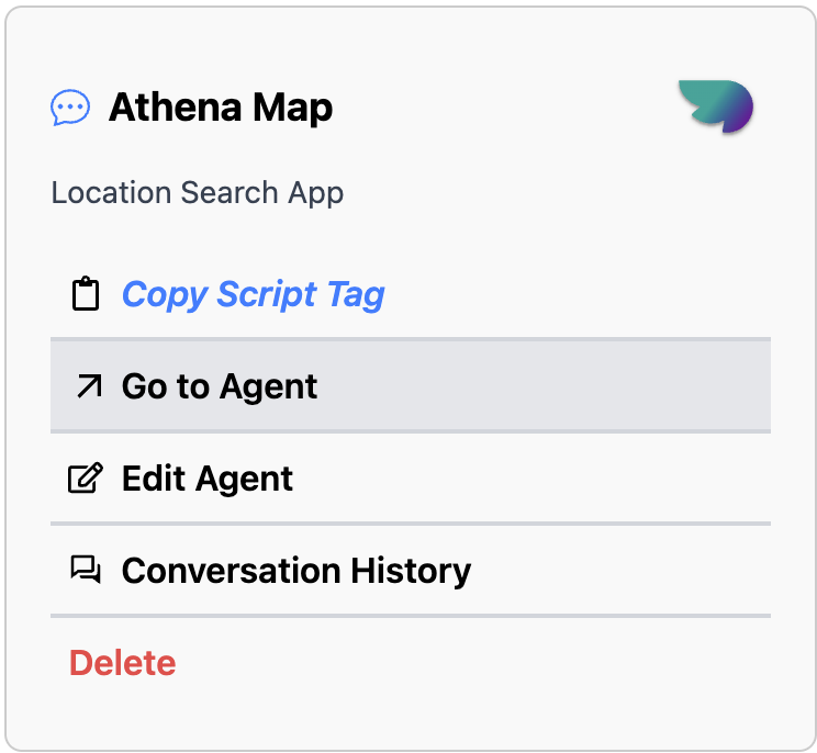
- Go check to https://athenachat.bot/chatbot/mybots and click on "Go to Agent" to chat with your own agent.
Next steps
From there, you can iterate on the UI/UX, prompts, tool metadata, and the overall experience.
Refresh the connector after each change to the MCP server (tools, metadata, etc.) You can do this by clicking the Refresh button in Settings → Connectors after selecting your connector.
Read our guidelines to learn more about the best practices for building apps for Athena, and make sure you research your use case and read our design guidelines before building.
Once you understand the basics, you can leverage the Agent SDK to build an Athena UI using the SDK primitives, authenticate users if needed, and persist state.
MCP
What is MCP?
The Model Context Protocol (MCP) is an open specification for connecting large language model clients to external tools and resources. An MCP server exposes tools that a model can call during a conversation, and return results given specified parameters.
Other resources (metadata) can be returned along with tool results, including the inline html that we can use in the Agent SDK to render an interface.
With Agent SDK, MCP is the backbone that keeps server, model, and UI in sync. By standardising the wire format, authentication, and metadata, it lets Athena AI reason about your app the same way it reasons about built-in tools.
Protocol building blocks
A minimal MCP server for Agent SDK implements three capabilities:
- List tools – your server advertises the tools it supports, including their JSON Schema input and output contracts and optional annotations.
- Call tools – when a model selects a tool to use, it sends a
call_toolrequest with the arguments corresponding to the user intent. Your server executes the action and returns structured content the model can parse. - Return components – in addition to structured content returned by the tool, each tool (in its metadata) can optionally point to an embedded resource that represents the interface to render in the Athena client.
The protocol is transport agnostic, you can host the server over Server-Sent Events or Streamable HTTP. Agent SDK supports both options, but we recommend Streamable HTTP.
Why Agent SDK standardises on MCP
Working through MCP gives you several benefits out of the box:
- Discovery integration – the model consumes your tool metadata and surface descriptions the same way it does for first-party connectors, enabling natural-language discovery and launcher ranking. See Research use cases for details.
- Conversation awareness – structured content and component state flow through the conversation. The model can inspect the JSON result, refer to IDs in follow-up turns, or render the component again later.
- Multiclient support – MCP is self-describing, so your connector works across Athena web and mobile without custom client code.
- Extensible auth – the specification includes protected resource metadata, OAuth 2.1 flows, and dynamic client registration so you can control access without inventing a proprietary handshake.
Next steps
If you're new to MCP, we recommend starting with the following resources:
- Model Context Protocol specification
- Official SDKs: Python SDK (official; includes FastMCP module) and TypeScript
- MCP Inspector for local debugging
Once you are comfortable with the MCP primitives, you can move on to the Set up your server guide for implementation details.
UX principles
Overview
Creating a great Athena app is about delivering a focused, conversational experience that feels native to Athena.
The goal is to design experiences that feel consistent and useful while extending what you can do in Athena conversations in ways that add real value.
Good examples include booking a ride, ordering food, checking availability, or tracking a delivery. These are tasks that are conversational, time bound, and easy to summarize visually with a clear call to action. Poor examples include replicating long form content from a website, requiring complex multi step workflows, or using the space for ads or irrelevant messaging.
Use the UX principles below to guide your development.
Principles for great app UX
An app should do at least one thing better because it lives in Athena:
- Conversational leverage – natural language, thread context, and multi-turn guidance unlock workflows that traditional UI cannot.
- Native fit – the app feels embedded in Athena, with seamless hand-offs between the model and your tools.
- Composability – actions are small, reusable building blocks that the model can mix with other apps to complete richer tasks.
If you cannot describe the clear benefit of running inside Athena, keep iterating before publishing your app.
On the other hand, your app should also improve the user experience in Athena by either providing something new to know, new to do, or a better way to show information.
Below are a few principles you should follow to help ensure your app is a great fit for Athena.
1. Extract, don’t port
Focus on the core jobs users use your product for. Instead of mirroring your full website or native app, identify a few atomic actions that can be extracted as tools. Each tool should expose the minimum inputs and outputs needed for the model to take the next step confidently.
2. Design for conversational entry
Expect users to arrive mid-conversation, with a specific task in mind, or with fuzzy intent. Your app should support:
- Open-ended prompts (e.g. "Help me plan a team offsite").
- Direct commands (e.g. "Book the conference room Thursday at 3pm").
- First-run onboarding (teach new users how to engage through Athena).
3. Design for the Athena environment
Athena provides the conversational surface. Use your UI selectively to clarify actions, capture inputs, or present structured results. Skip ornamental components that do not advance the current task, and lean on the conversation for relevant history, confirmation, and follow-up.
4. Optimize for conversation, not navigation
The model handles state management and routing. Your app supplies:
- Clear, declarative actions with well-typed parameters.
- Concise responses that keep the chat moving (tables, lists, or short paragraphs instead of dashboards).
- Helpful follow-up suggestions so the model can keep the user in flow.
5. Embrace the ecosystem moment
Highlight what is unique about your app inside Athena:
- Accept rich natural language instead of form fields.
- Personalize with relevant context gleaned from the conversation.
- (Optional) Compose with other apps when it saves the user time or cognitive load.
Checklist before publishing
Answer these yes/no questions before publishing your app. A “no” signals an opportunity to improve your app and have a chance at broader distribution once we open up app submissions later this year.
However, please note that we will evaluate each app on a case-by-case basis, and that answering "yes" to all of these questions does not guarantee that your app will be selected for distribution: it's only a baseline to help your app be a great fit for Athena.
To learn about strict requirements for publishing your app, see the App Developer Guidelines.
- Conversational value – Does at least one primary capability rely on Athena’s strengths (natural language, conversation context, multi-turn dialog)?
- Beyond base Athena – Does the app provide new knowledge, actions, or presentation that users cannot achieve without it (e.g., proprietary data, specialized UI, or a guided flow)?
- Atomic, model-friendly actions – Are tools indivisible, self-contained, and defined with explicit inputs and outputs so the model can invoke them without clarifying questions?
- Helpful UI only – Would replacing every custom widget with plain text meaningfully degrade the user experience?
- End-to-end in-chat completion – Can users finish at least one meaningful task without leaving Athena or juggling external tabs?
- Performance & responsiveness – Does the app respond quickly enough to maintain the rhythm of a chat?
- Discoverability – Is it easy to imagine prompts where the model would select this app confidently?
- Platform fit – Does the app take advantage of core platform behaviors (rich prompts, prior context, multi-tool composition, multimodality, or memory)?
Additionally, ensure that you avoid:
- Displaying long-form or static content better suited for a website or app.
- Requiring complex multi-step workflows that exceed the inline or fullscreen display modes.
- Using the space for ads, upsells, or irrelevant messaging.
- Surfacing sensitive or private information directly in a card where others might see it.
- Duplicating Athena’s system functions (for example, recreating the input composer).
Next steps
Once you have made sure your app has great UX, you can polish your app's UI by following our recommendations in the UI guidelines.
UI guidelines
Overview
Apps are developer-built experiences that are available in Athena. They extend what users can do without breaking the flow of conversation, appearing through lightweight cards, carousels, fullscreen views, and other display modes that integrate seamlessly into Athena’s interface.
Before you start designing your app visually, make sure you have reviewed our recommended UX principles.
Design system
To help you design high quality apps that feel native to Athena, you can use the Agent SDK UI design system.
It provides styling foundations with Tailwind, CSS variable design tokens, and a library of well-crafted, accessible components.
Using the Agent SDK UI is not a requirement to build your app, but it will make building an app for Athena faster and easier, in a way that is consistent with the Athena design system.
Before diving into code, start designing with ChatGPT's Figma component library.
Display modes
Display modes are the surfaces developers use to create experiences for apps in Athena. They allow partners to show content and actions that feel native to conversation. Each mode is designed for a specific type of interaction, from quick confirmations to immersive workflows.
Using these consistently helps experiences stay simple and predictable.
Inline
The inline display mode appears directly in the flow of the conversation. Inline surfaces currently always appear before the generated model response. Every agent initially appears inline.
Layout
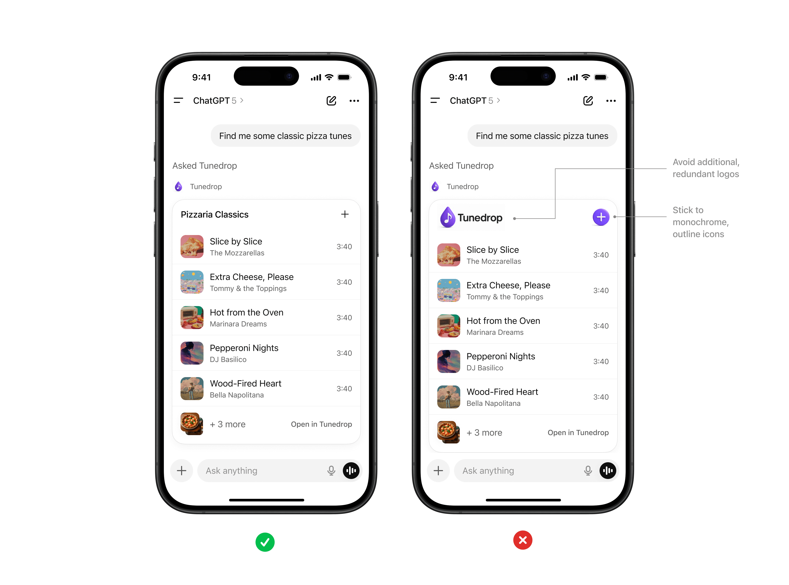
- Icon & tool call: A label with the app name and icon.
- Inline display: A lightweight display with app content embedded above the model response.
- Follow-up: A short, model-generated response shown after the widget to suggest edits, next steps, or related actions. Avoid content that is redundant with the card.
Inline card
Lightweight, single-purpose widgets embedded directly in conversation. They provide quick confirmations, simple actions, or visual aids.
When to use
- A single action or decision (for example, confirm a booking).
- Small amounts of structured data (for example, a map, order summary, or quick status).
- A fully self-contained widget or tool (e.g., an audio player or a score card).
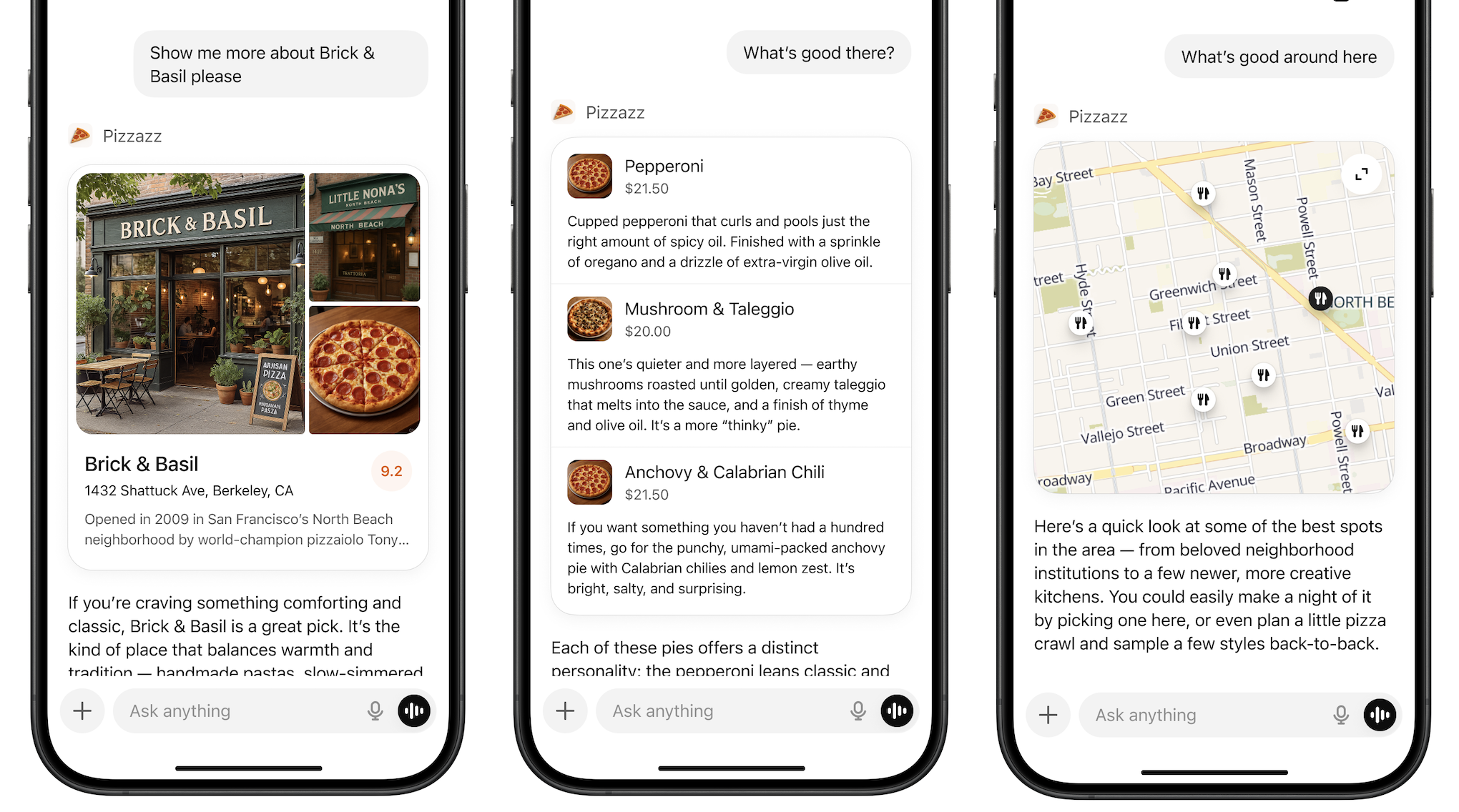
Layout
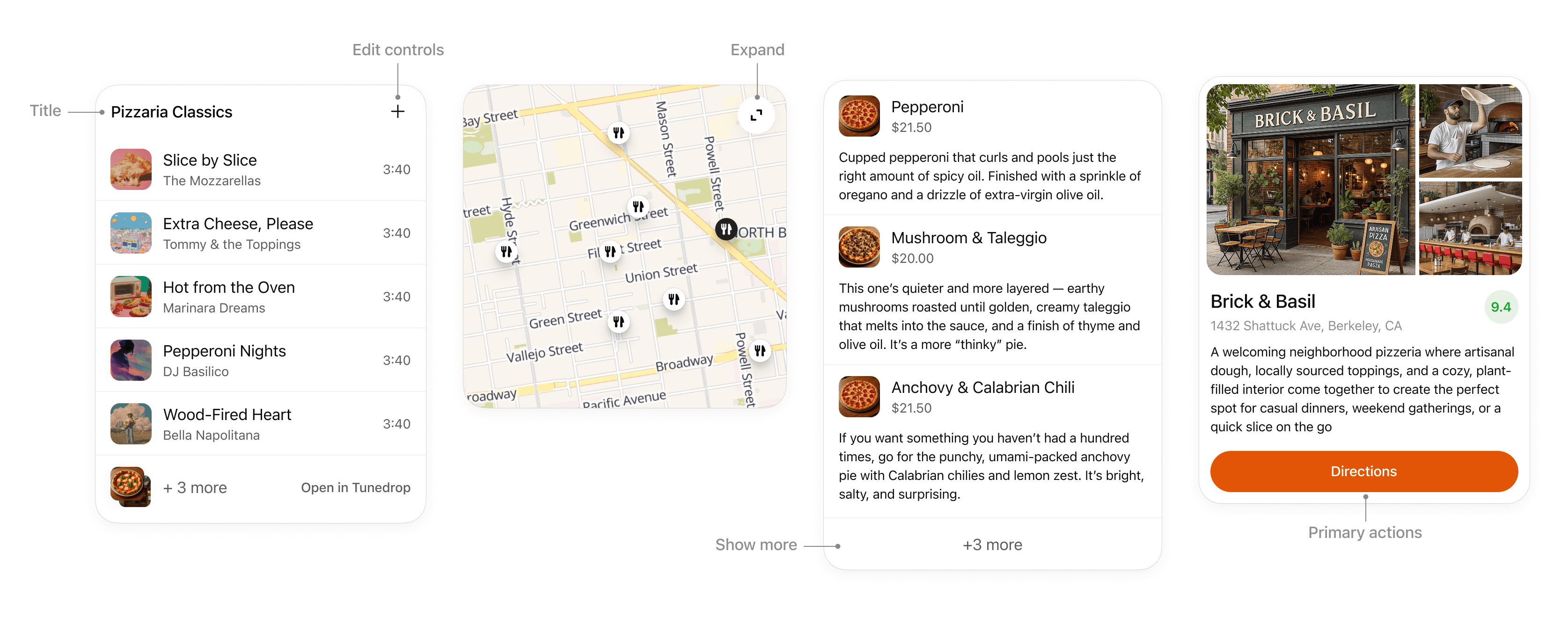
- Title: Include a title if your card is document-based or contains items with a parent element, like songs in a playlist.
- Expand: Use to open a fullscreen display mode if the card contains rich media or interactivity like a map or an interactive diagram.
- Show more: Use to disclose additional items if multiple results are presented in a list.
- Edit controls: Provide inline support for app responses without overwhelming the conversation.
- Primary actions: Limit to two actions, placed at bottom of card. Actions should perform either a conversation turn or a tool call.
Interaction
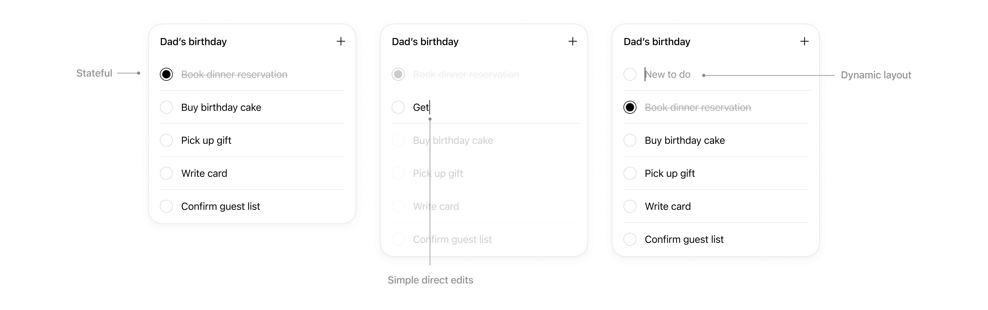
Cards support simple direct interaction.
- States: Edits made are persisted.
- Simple direct edits: If appropriate, inline editable text allows users to make quick edits without needing to prompt the model.
- Dynamic layout: Card layout can expand its height to match its contents up to the height of the mobile viewport.
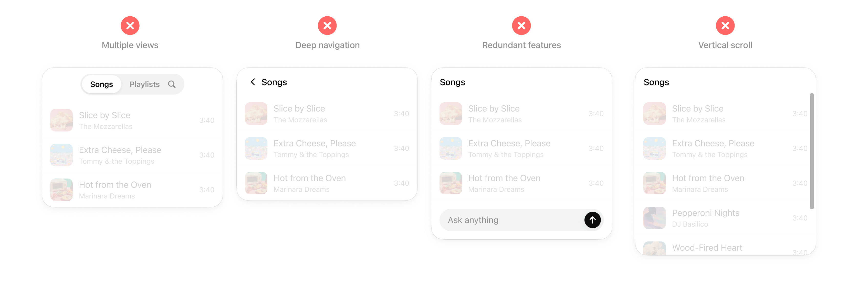
Rules of thumb
- Limit primary actions per card: Support up to two actions maximum, with one primary CTA and one optional secondary CTA.
- No deep navigation or multiple views within a card: Cards should not contain multiple drill-ins, tabs, or deeper navigation. Consider splitting these into separate cards or tool actions.
- No nested scrolling: Cards should auto-fit their content and prevent internal scrolling.
- No duplicative inputs: Don’t replicate Athena features in a card.
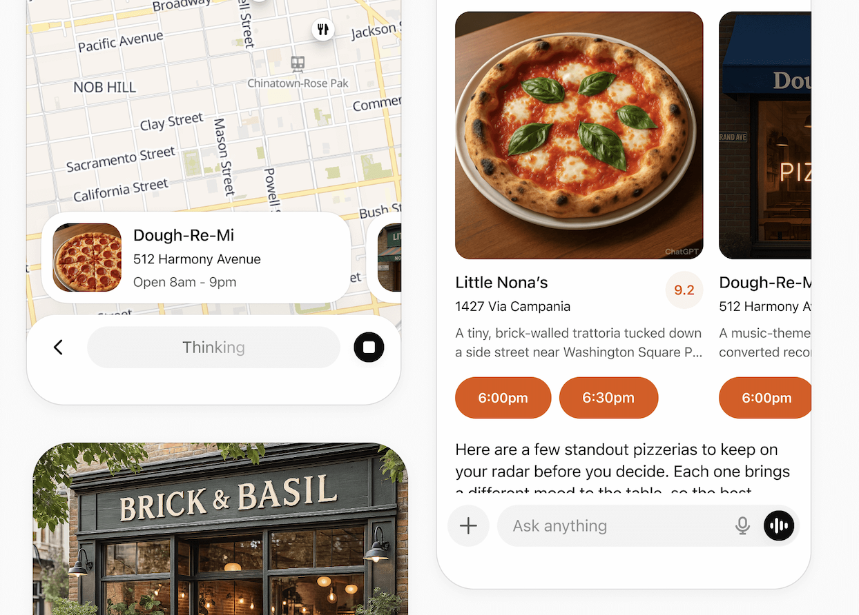
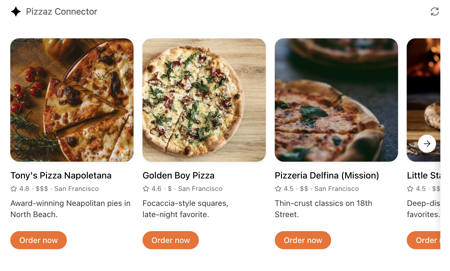
Inline carousel
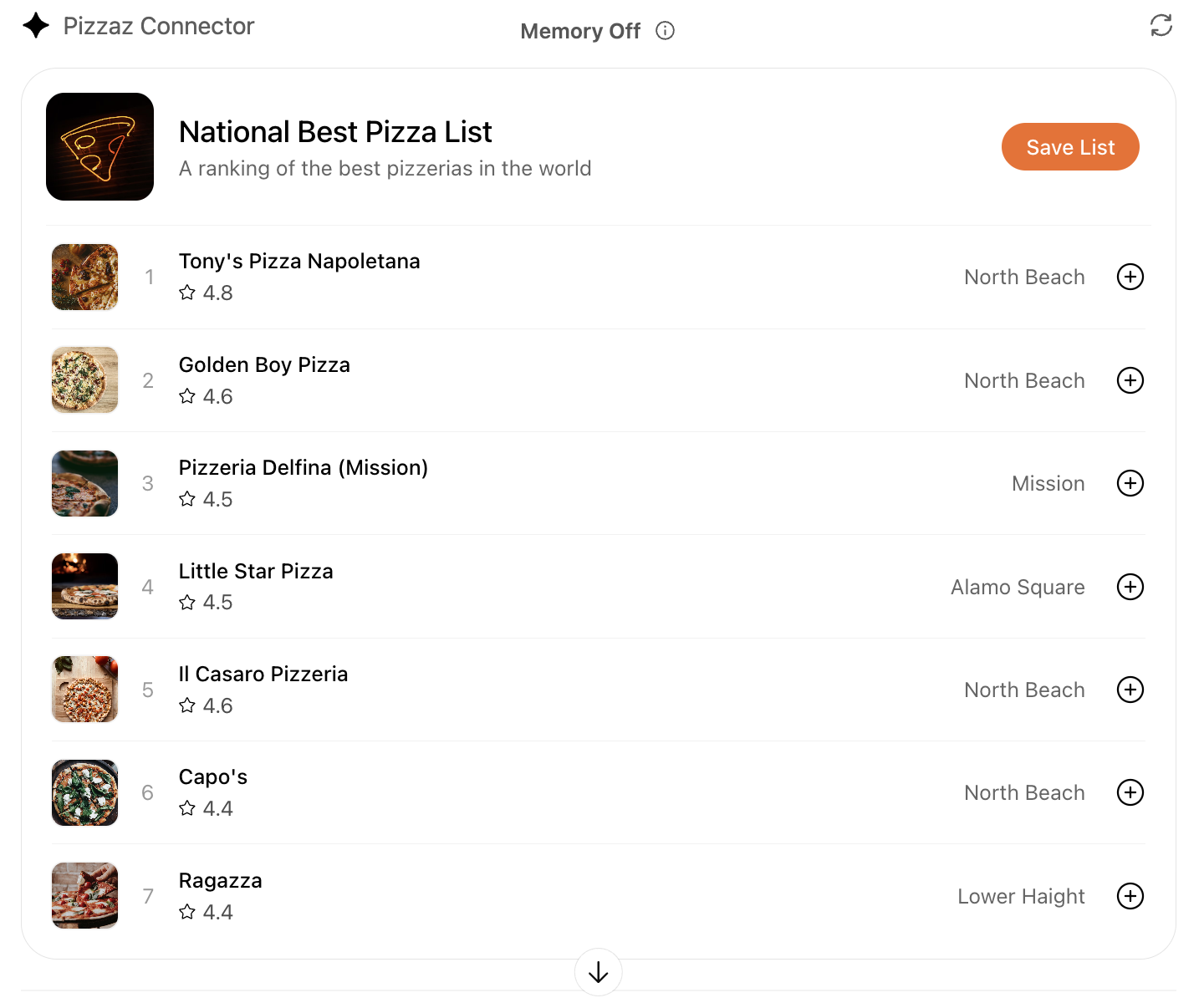
A set of cards presented side-by-side, letting users quickly scan and choose from multiple options.
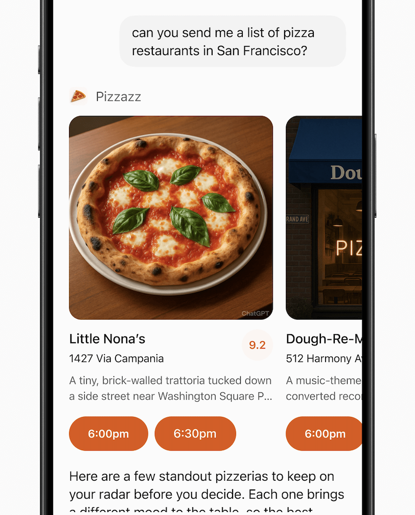
When to use
- Presenting a small list of similar items (for example, restaurants, playlists, events).
- Items have more visual content and metadata than will fit in simple rows.
Layout
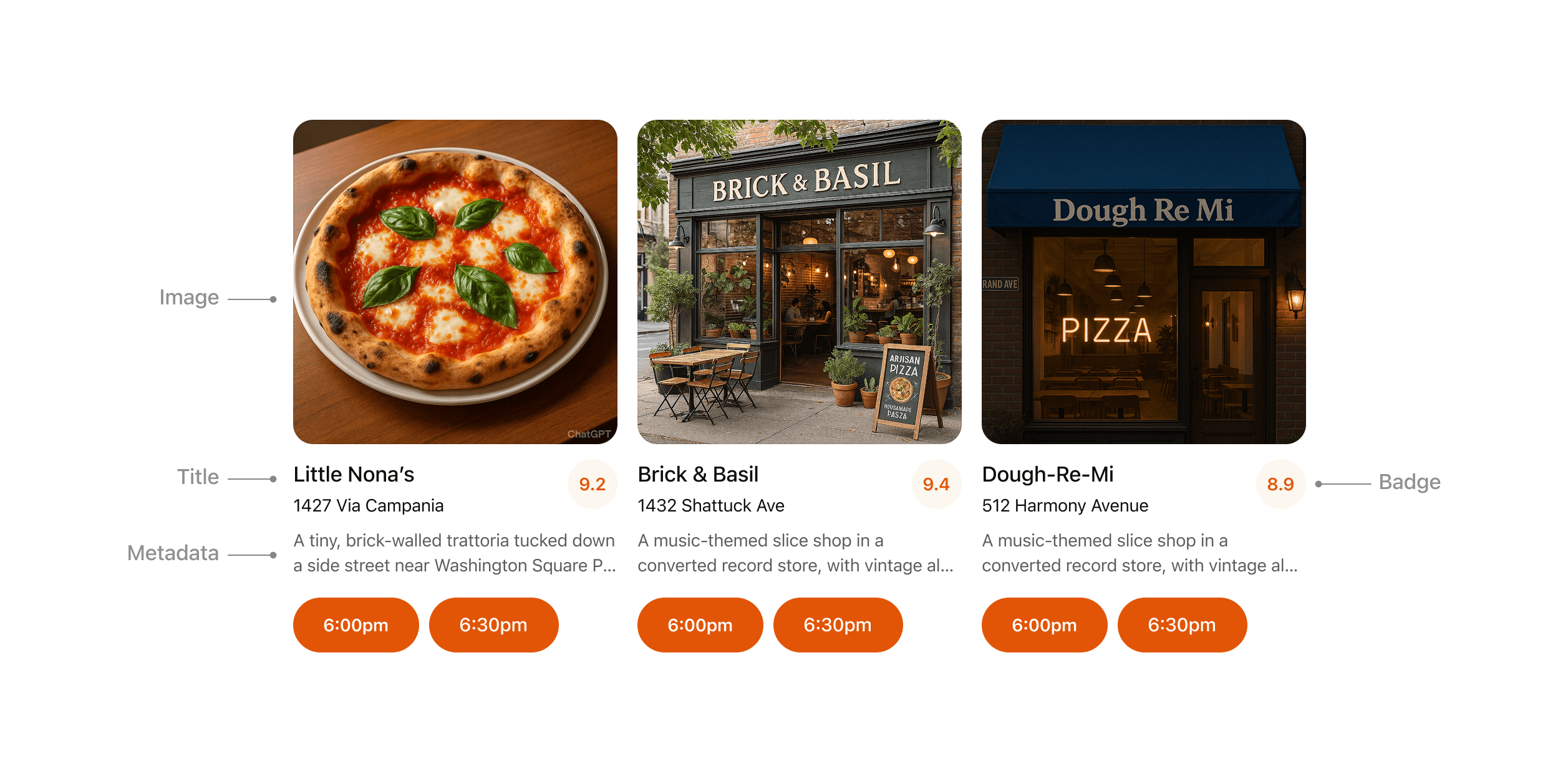
- Image: Items should always include an image or visual.
- Title: Carousel items should typically include a title to explain the content.
- Metadata: Use metadata to show the most important and relevant information about the item in the context of the response. Avoid showing more than two lines of text.
- Badge: Use the badge to show supporting context where appropriate.
- Actions: Provide a single clear CTA per item whenever possible.
Rules of thumb
- Keep to 3–8 items per carousel for scannability.
- Reduce metadata to the most relevant details, with three lines max.
- Each card may have a single, optional CTA (for example, “Book” or “Play”).
- Use consistent visual hierarchy across cards.
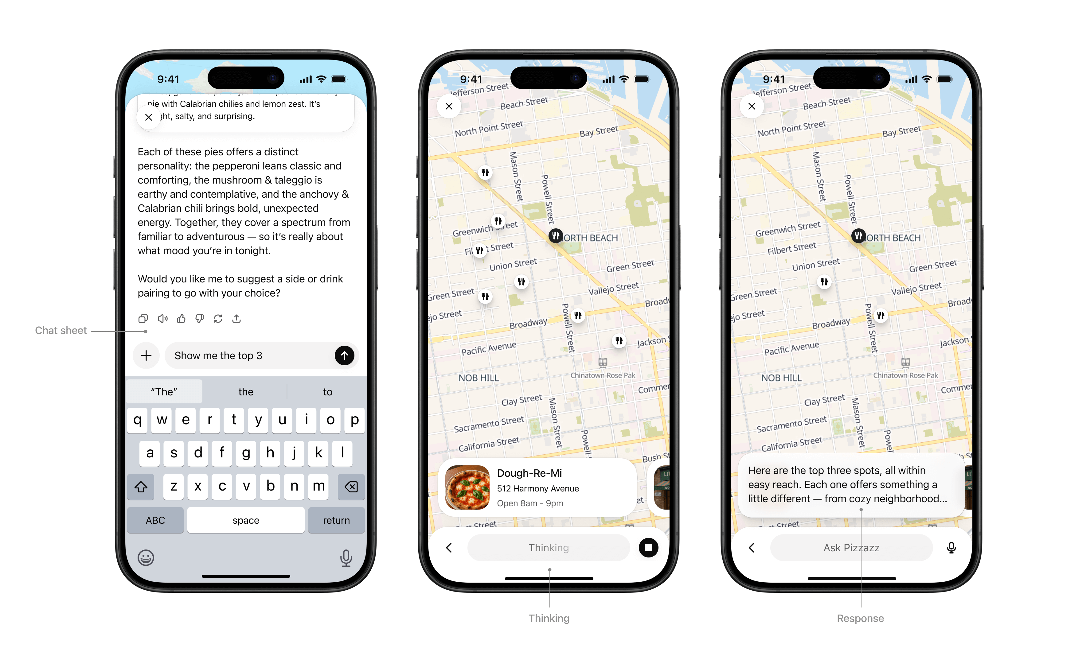
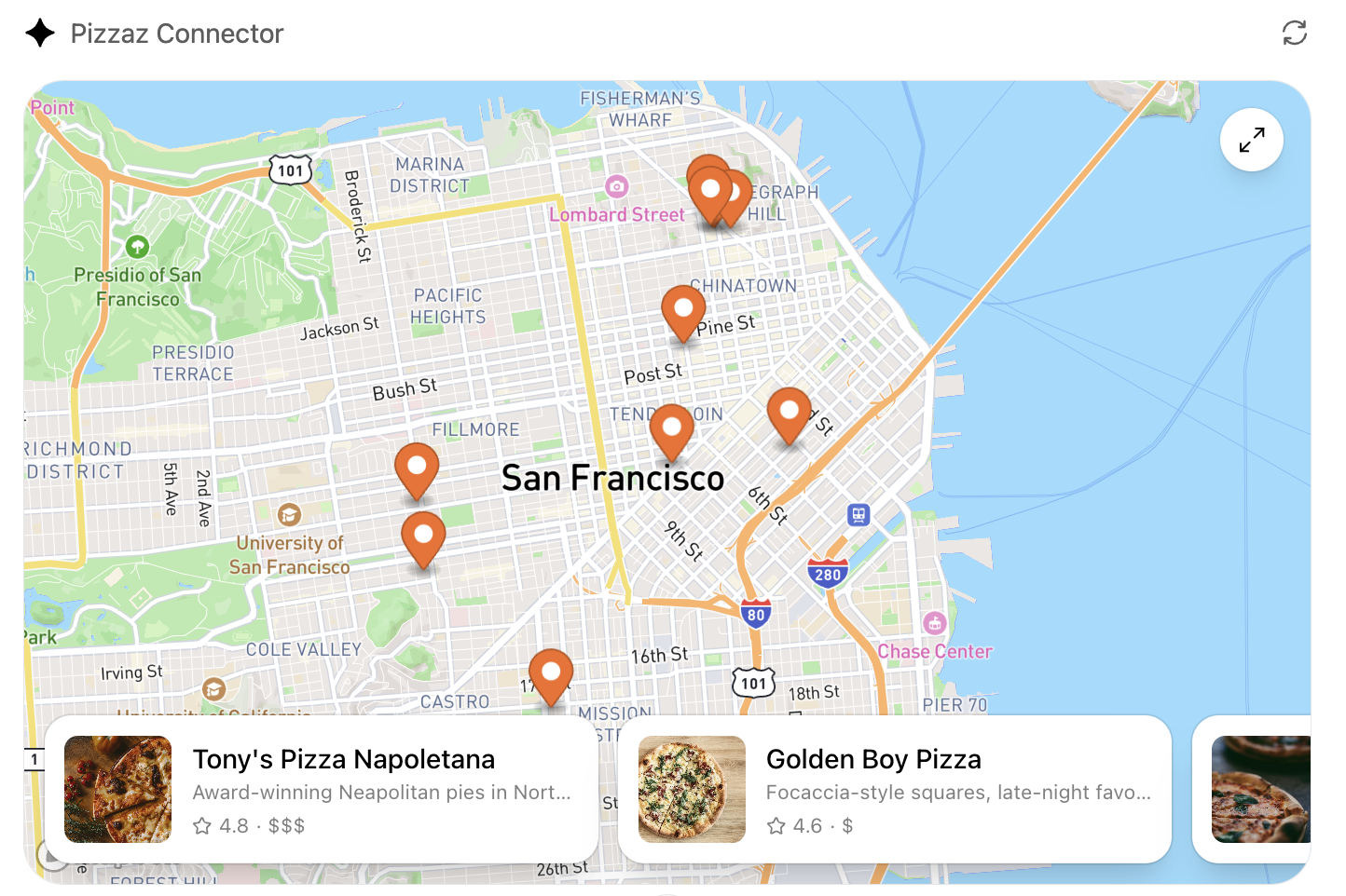
Fullscreen
Immersive experiences that expand beyond the inline card, giving users space for multi-step workflows or deeper exploration. The Athena composer remains overlaid, allowing users to continue “talking to the app” through natural conversation in the context of the fullscreen view.
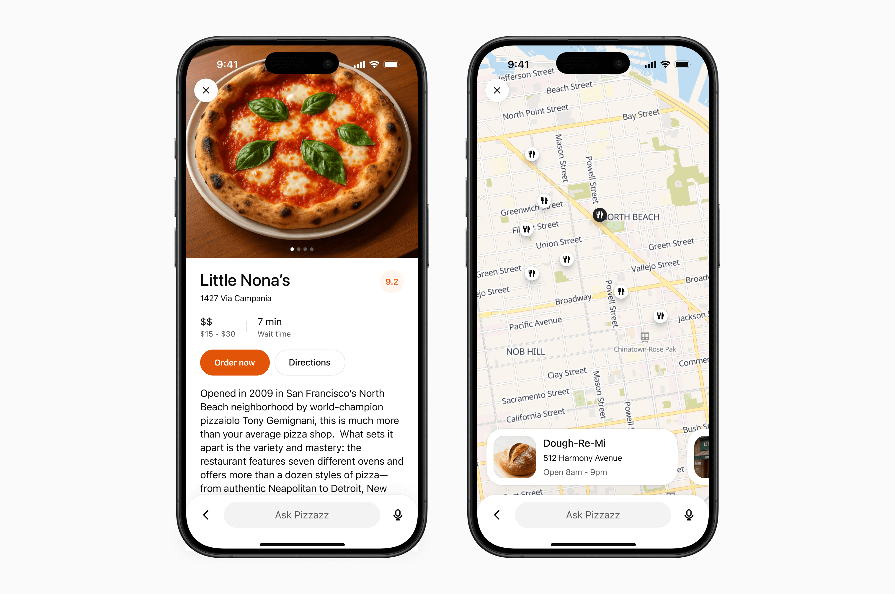
When to use
- Rich tasks that cannot be reduced to a single card (for example, an explorable map with pins, a rich editing canvas, or an interactive diagram).
- Browsing detailed content (for example, real estate listings, menus).
Layout
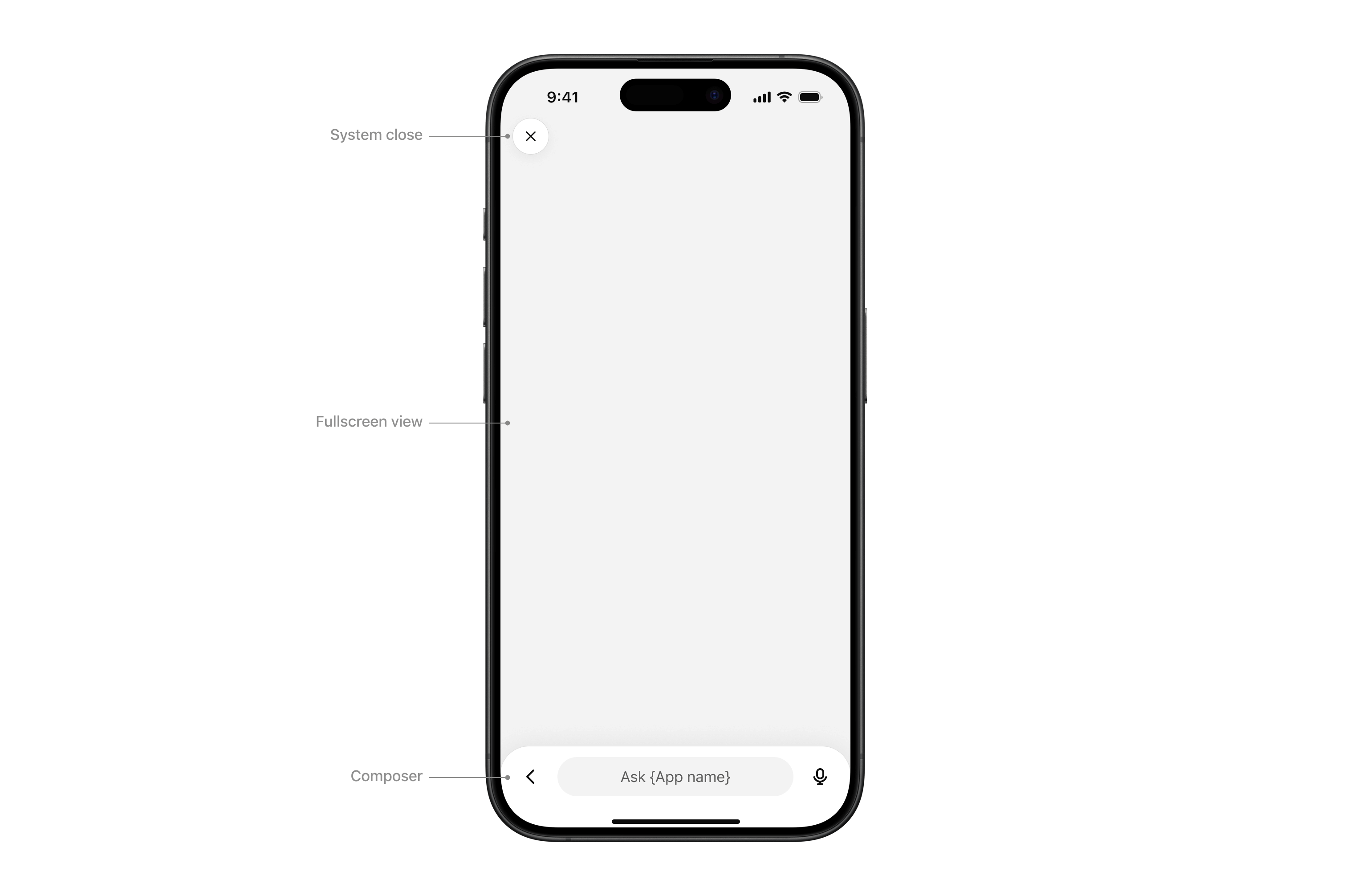
- System close: Closes the sheet or view.
- Fullscreen view: Content area.
- Composer: Athena’s native composer, allowing the user to follow up in the context of the fullscreen view.
Interaction
- Chat sheet: Maintain conversational context alongside the fullscreen surface.
- Thinking: The composer input “shimmers” to show that a response is streaming.
- Response: When the model completes its response, an ephemeral, truncated snippet displays above the composer. Tapping it opens the chat sheet.
Rules of thumb
- Design your UX to work with the system composer: The composer is always present in fullscreen, so make sure your experience supports conversational prompts that can trigger tool calls and feel natural for users.
- Use fullscreen to deepen engagement, not to replicate your native app wholesale.
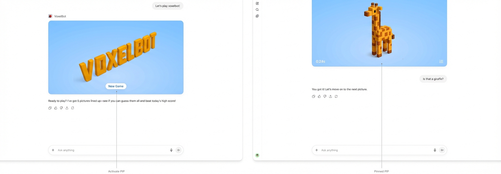
Picture-in-picture (PiP)
A persistent floating window inside Athena optimized for ongoing or live sessions like games or videos. PiP remains visible while the conversation continues, and it can update dynamically in response to user prompts.
When to use
- Activities that run in parallel with conversation, such as a game, live collaboration, quiz, or learning session.
- Situations where the PiP widget can react to chat input, for example continuing a game round or refreshing live data based on a user request.
Interaction
- Activated: On scroll, the PiP window stays fixed to the top of the viewport
- Pinned: The PiP remains fixed until the user dismisses it or the session ends.
- Session ends: The PiP returns to an inline position and scrolls away.
Rules of thumb
- Ensure the PiP state can update or respond when users interact through the system composer.
- Close PiP automatically when the session ends.
- Do not overload PiP with controls or static content better suited for inline or fullscreen.
Visual design guidelines
A consistent look and feel helps partner-built tools feel like a natural part of the Athena platform. Visual guidelines support clarity, usability, and accessibility, while still leaving room for brand expression in the right places.
These principles outline how to use color, type, spacing, and imagery in ways that preserve system clarity while giving partners space to differentiate their service.
Why this matters
Visual and UX consistency helps improve the overall user experience of using apps in Athena. By following these guidelines, partners can present their tools in a way that feels consistent to users and delivers value without distraction.
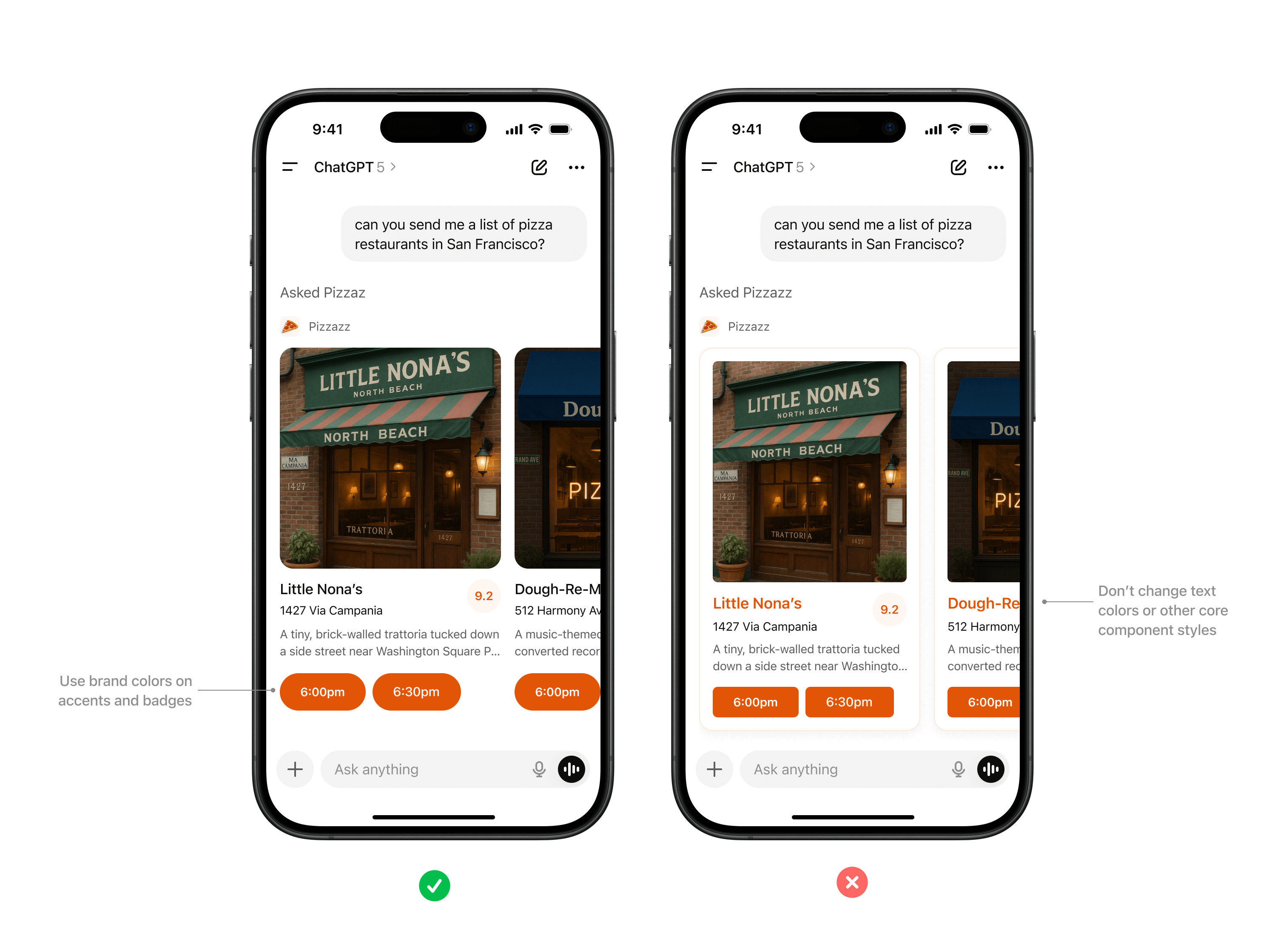
Color
System-defined palettes help ensure actions and responses always feel consistent with the Athena platform. Partners can add branding through accents, icons, or inline imagery, but should not redefine system colors.
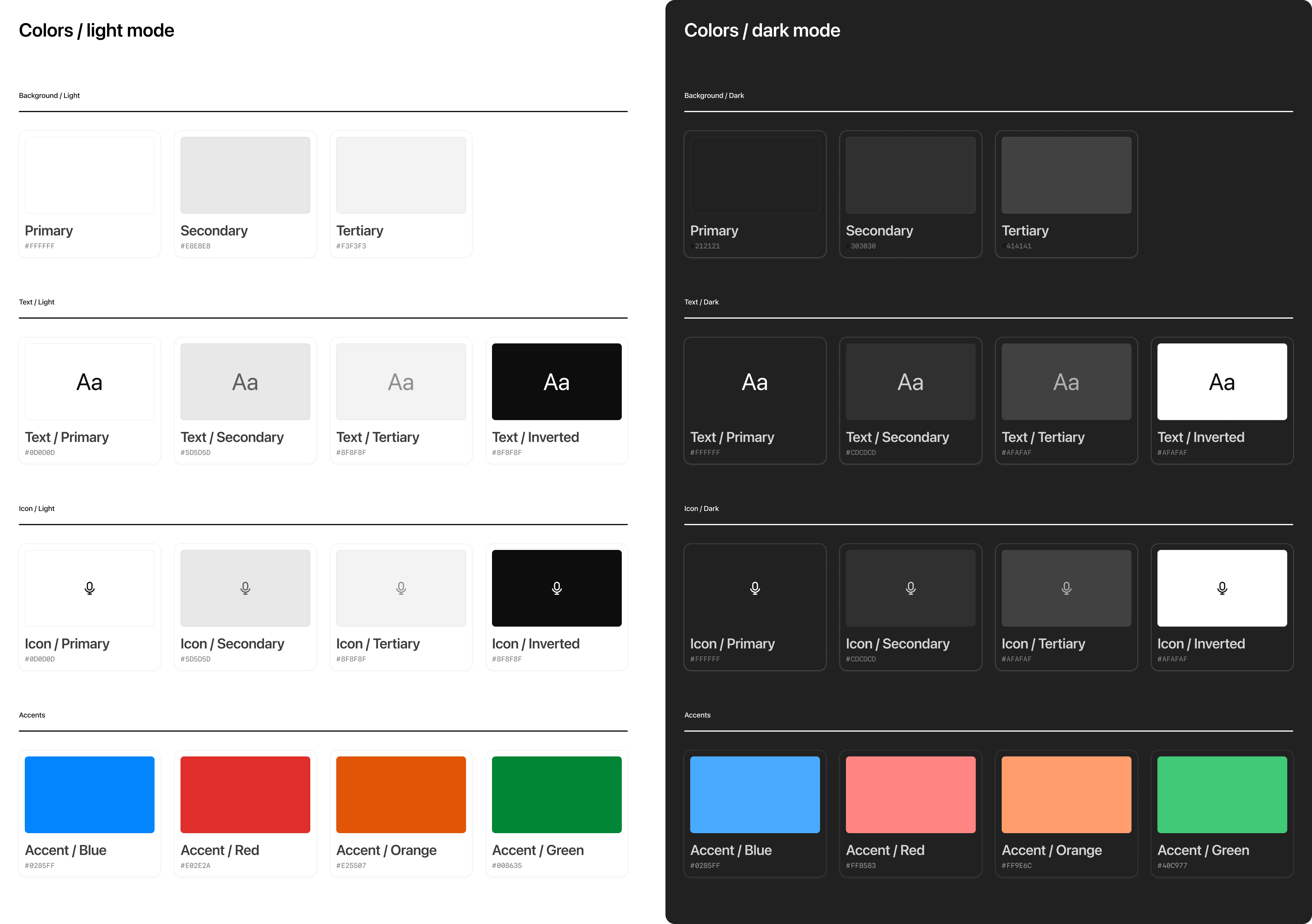
Rules of thumb
- Use system colors for text, icons, and spatial elements like dividers.
- Partner brand accents such as logos or icons should not override backgrounds or text colors.
- Avoid custom gradients or patterns that break Athena’s minimal look.
- Use brand accent colors on primary buttons inside app display modes.
Typography
Athena uses platform-native system fonts (SF Pro on iOS, Roboto on Android) to ensure readability and accessibility across devices.
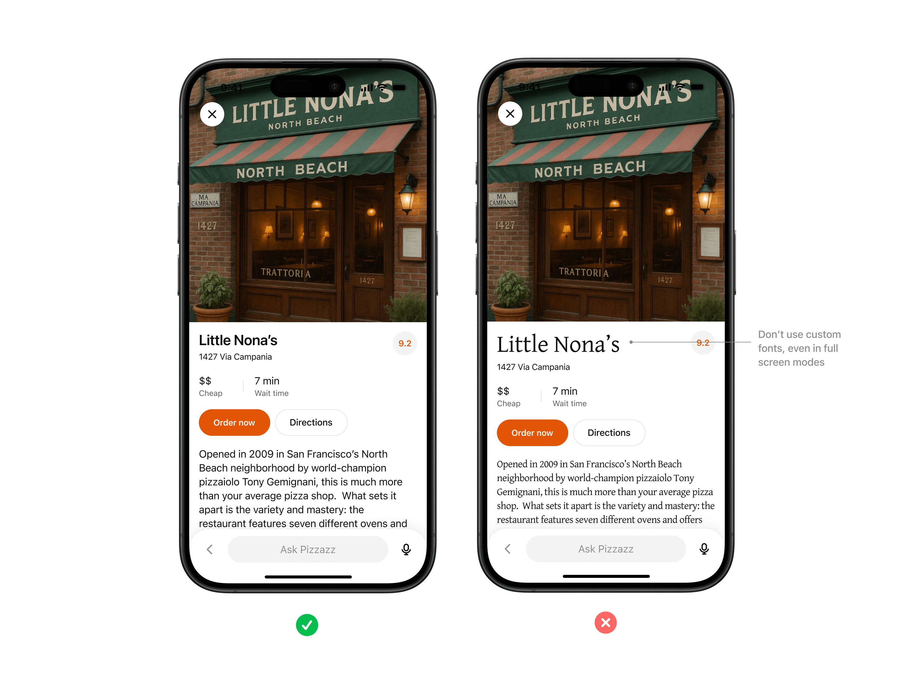
Rules of thumb
- Always inherit the system font stack, respecting system sizing rules for headings, body text, and captions.
- Use partner styling such as bold, italic, or highlights only within content areas, not for structural UI.
- Limit variation in font size as much as possible, preferring body and body-small sizes.

Don't use custom fonts, even in full screen modes. Use system font variables wherever possible.
Spacing & layout
Consistent margins, padding, and alignment keep partner content scannable and predictable inside conversation.
Rules of thumb
- Use system grid spacing for cards, collections, and inspector panels.
- Keep padding consistent and avoid cramming or edge-to-edge text.
- Respect system specified corner rounds when possible to keep shapes consistent.
- Maintain visual hierarchy with headline, supporting text, and CTA in a clear order.
Icons & imagery
System iconography provides visual clarity, while partner logos and images help users recognize brand context.
Rules of thumb
- Use either system icons or custom iconography that fits within Athena's visual world — monochromatic and outlined.
- Do not include your logo as part of the response. Athena will always append your logo and app name before the widget is rendered.
- All imagery must follow enforced aspect ratios to avoid distortion.
Accessibility
Every partner experience should be usable by the widest possible audience.
Accessibility should be a core consideration when you are building apps for Athena.
Rules of thumb
- Text and background must maintain a minimum contrast ratio (WCAG AA).
- Provide alt text for all images.
- Support text resizing without breaking layouts.
Research use cases
Why start with use cases
Every successful Agent SDK app starts with a crisp understanding of what the user is trying to accomplish. Discovery in Athena is model-driven: the assistant chooses your app when your tool metadata, descriptions, and past usage align with the user’s prompt and memories. That only works if you have already mapped the tasks the model should recognize and the outcomes you can deliver.
Use this page to capture your hypotheses, pressure-test them with prompts, and align your team on scope before you define tools or build components.
Gather inputs
Begin with qualitative and quantitative research:
- User interviews and support requests – capture the jobs-to-be-done, terminology, and data sources users rely on today.
- Prompt sampling – list direct asks (e.g., “show my Jira board”) and indirect intents (“what am I blocked on for the launch?”) that should route to your app.
- System constraints – note any compliance requirements, offline data, or rate limits that will influence tool design later.
Document the user persona, the context they are in when they reach for Athena, and what success looks like in a single sentence for each scenario.
Define evaluation prompts
Decision boundary tuning is easier when you have a golden set to iterate against. For each use case:
- Author at least five direct prompts that explicitly reference your data, product name, or verbs you expect the user to say.
- Draft five indirect prompts where the user states a goal but not the tool (“I need to keep our launch tasks organized”).
- Add negative prompts that should not trigger your app so you can measure precision.
Use these prompts later in Optimize metadata to hill-climb on recall and precision without overfitting to a single request.
Scope the minimum lovable feature
For each use case decide:
- What information must be visible inline to answer the question or let the user act.
- Which actions require write access and whether they should be gated behind confirmation in developer mode.
- What state needs to persist between turns—for example, filters, selected rows, or draft content.
Rank the use cases based on user impact and implementation effort. A common pattern is to ship one P0 scenario with a high-confidence component, then expand to P1 scenarios once discovery data confirms engagement.
Translate use cases into tooling
Once a scenario is in scope, draft the tool contract:
- Inputs: the parameters the model can safely provide. Keep them explicit, use enums when the set is constrained, and document defaults.
- Outputs: the structured content you will return. Add fields the model can reason about (IDs, timestamps, status) in addition to what your UI renders.
- Component intent: whether you need a read-only viewer, an editor, or a multiturn workspace. This influences the component planning and storage model later.
Review these drafts with stakeholders—especially legal or compliance teams—before you invest in implementation. Many integrations require PII reviews or data processing agreements before they can ship to production.
Prepare for iteration
Even with solid planning, expect to revise prompts and metadata after your first dogfood. Build time into your schedule for:
- Rotating through the golden prompt set weekly and logging tool selection accuracy.
- Collecting qualitative feedback from early testers in Athena developer mode.
- Capturing analytics (tool calls, component interactions) so you can measure adoption.
These research artifacts become the backbone for your roadmap, changelog, and success metrics once the app is live.
Define tools
Tool-first thinking
In Agent SDK, tools are the contract between your MCP server and the model. They describe what the connector can do, how to call it, and what data comes back. Good tool design makes discovery accurate, invocation reliable, and downstream UX predictable.
Use the checklist below to turn your use cases into well-scoped tools before you touch the SDK.
Draft the tool surface area
Start from the user journey defined in your use case research:
- One job per tool – keep each tool focused on a single read or write action ("fetch_board", "create_ticket"), rather than a kitchen-sink endpoint. This helps the model decide between alternatives.
- Explicit inputs – define the shape of
inputSchemanow, including parameter names, data types, and enums. Document defaults and nullable fields so the model knows what is optional. - Predictable outputs – enumerate the structured fields you will return, including machine-readable identifiers that the model can reuse in follow-up calls.
If you need both read and write behavior, create separate tools so Athena can respect confirmation flows for write actions.
Capture metadata for discovery
Discovery is driven almost entirely by metadata. For each tool, draft:
- Name – action oriented and unique inside your connector (
kanban.move_task). - Description – one or two sentences that start with "Use this when…" so the model knows exactly when to pick the tool.
- Parameter annotations – describe each argument and call out safe ranges or enumerations. This context prevents malformed calls when the user prompt is ambiguous.
- Global metadata – confirm you have app-level name, icon, and descriptions ready for the directory and launcher.
Later, plug these into your MCP server and iterate using the Optimize metadata workflow.
Model-side guardrails
Think through how the model should behave once a tool is linked:
- Prelinked vs. link-required – if your app can work anonymously, mark tools as available without auth. Otherwise, make sure your connector enforces linking via the onboarding flow described in Authentication.
- Read-only hints – set the
readOnlyHintannotation to specify tools which cannot mutate state. - Destructive hints - set the
destructiveHintannotation to specify which tools do delete or overwrite user data. - Open-world hints - set the
openWorldHintannotation to specify which tools publish content or reach outside the user's account. - Result components – decide whether each tool should render a component, return JSON only,
or both. Setting
_meta["openai/outputTemplate"]on the tool descriptor advertises the HTML template to Athena.
Golden prompt rehearsal
Before you implement, sanity-check your tool set against the prompt list you captured earlier:
- For every direct prompt, confirm you have exactly one tool that clearly addresses the request.
- For indirect prompts, ensure the tool descriptions give the model enough context to select your connector instead of a built-in alternative.
- For negative prompts, verify your metadata will keep the tool hidden unless the user explicitly opts in (e.g., by naming your product).
Capture any gaps or ambiguities now and adjust the plan—changing metadata before launch is much cheaper than refactoring code later.
Handoff to implementation
When you are ready to implement, compile the following into a handoff document:
- Tool name, description, input schema, and expected output schema.
- Whether the tool should return a component, and if so which UI component should render it.
- Auth requirements, rate limits, and error handling expectations.
- Test prompts that should succeed (and ones that should fail).
Bring this plan into the Set up your server guide to translate it into code with the MCP SDK of your choice.
Design components
Why components matter
UI components are the human-visible half of your connector. They let users view or edit data inline, switch to fullscreen when needed, and keep context synchronized between typed prompts and UI actions. Planning them early ensures your MCP server returns the right structured data and component metadata from day one.
Explore sample components
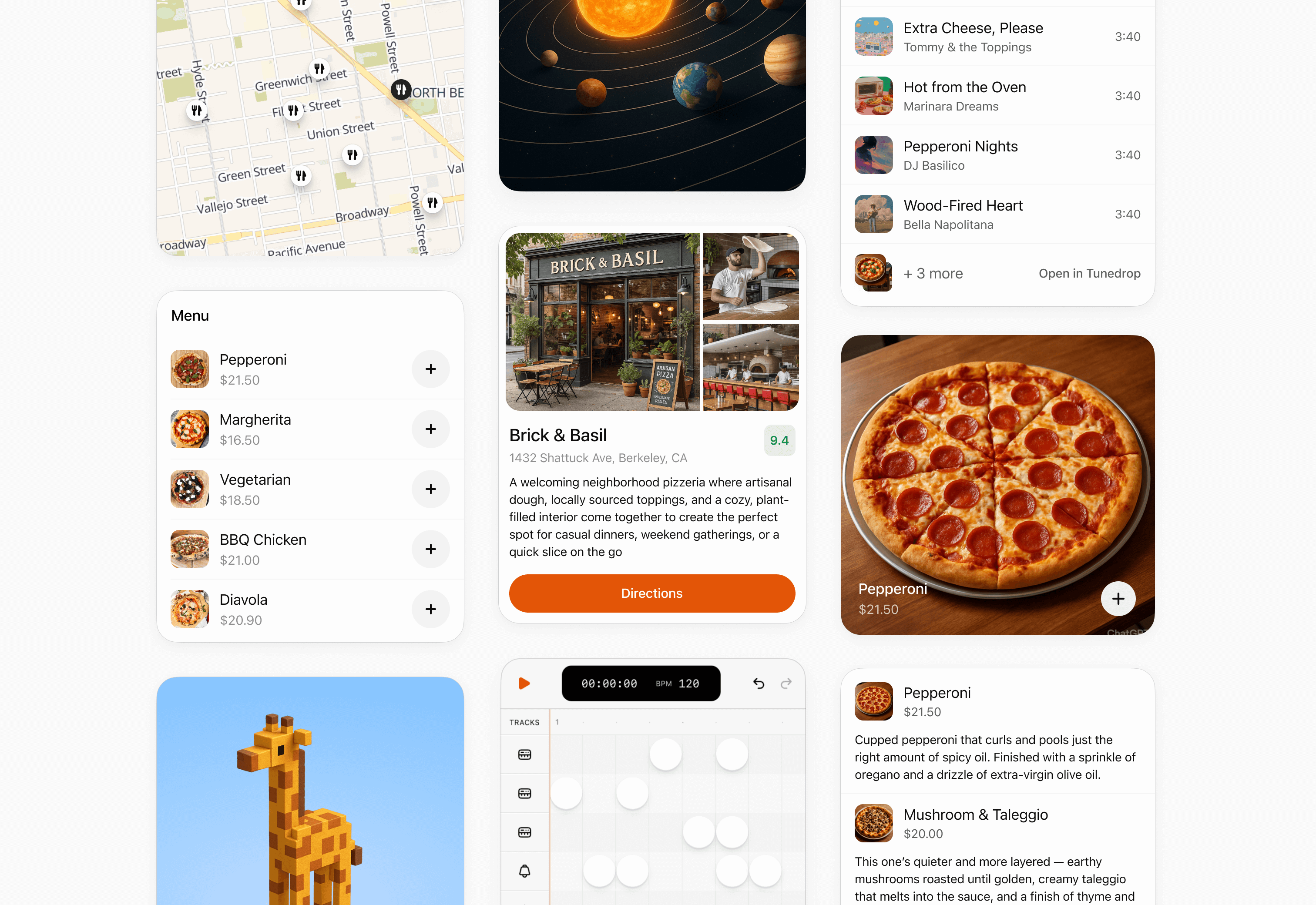
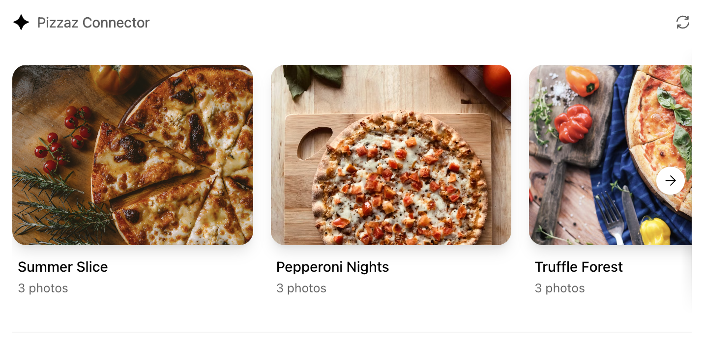
We publish reusable examples in openai-apps-sdk-examples so you can see common patterns before you build your own. The pizzaz gallery covers every default surface we provide today:
List
Renders dynamic collections with empty-state handling. View the code.
Map
Plots geo data with marker clustering and detail panes. View the code.
Album
Showcases media grids with fullscreen transitions. View the code.
Carousel
Highlights featured content with swipe gestures. View the code.
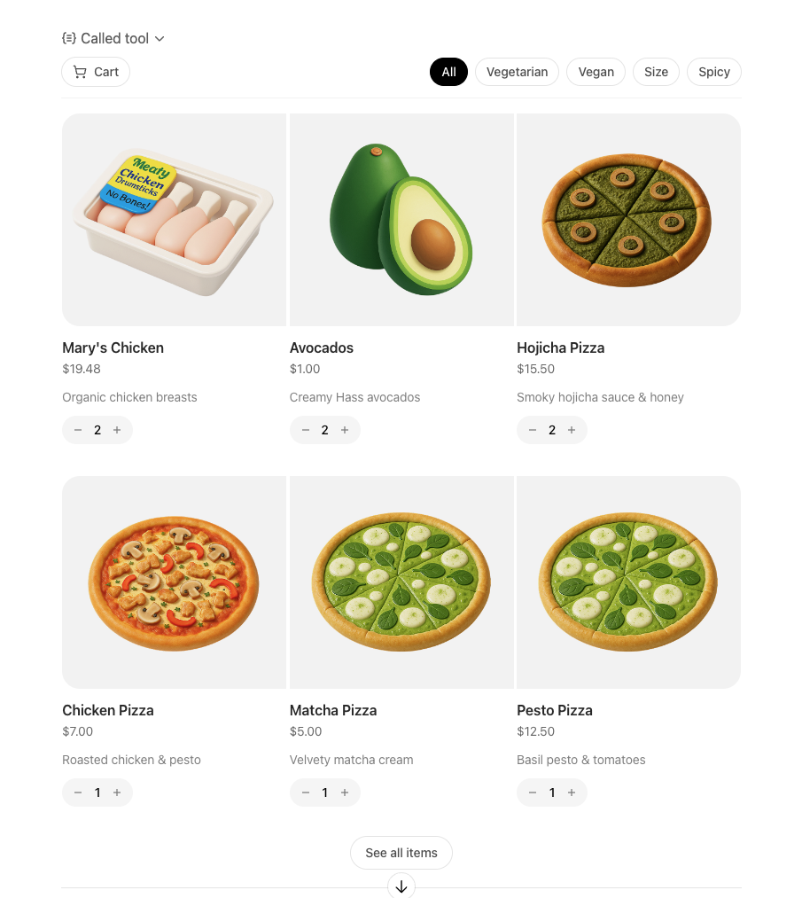
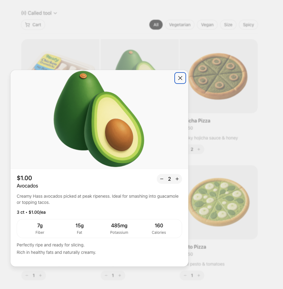
Shop
Demonstrates product browsing with checkout affordances. View the code.
Clarify the user interaction
For each use case, decide what the user needs to see and manipulate:
- Viewer vs. editor – is the component read-only (a chart, a dashboard) or should it support editing and writebacks (forms, kanban boards)?
- Single-shot vs. multiturn – will the user accomplish the task in one invocation, or should state persist across turns as they iterate?
- Inline vs. fullscreen – some tasks are comfortable in the default inline card, while others benefit from fullscreen or picture-in-picture modes. Sketch these states before you implement.
Write down the fields, affordances, and empty states you need so you can validate them with design partners and reviewers.
Map data requirements
Components should receive everything they need in the tool response. When planning:
- Structured content – define the JSON payload that the component will parse.
- Initial component state – use
window.openai.toolOutputas the initial render data. On subsequent followups that invokecallTool, use the return value ofcallTool. To cache state for re-rendering, you can usewindow.openai.setWidgetState. - Auth context – note whether the component should display linked-account information, or whether the model must prompt the user to connect first.
Feeding this data through the MCP response is simpler than adding ad-hoc APIs later.
Design for responsive layouts
Components run inside an iframe on both desktop and mobile. Plan for:
- Adaptive breakpoints – set a max width and design layouts that collapse gracefully on small screens.
- Accessible color and motion – respect system dark mode (match color-scheme) and provide focus states for keyboard navigation.
- Launcher transitions – if the user opens your component from the launcher or expands to fullscreen, make sure navigation elements stay visible.
Document CSS variables, font stacks, and iconography up front so they are consistent across components.
Define the state contract
Because components and the chat surface share conversation state, be explicit about what is stored where:
- Component state – use the
window.openai.setWidgetStateAPI to persist state the host should remember (selected record, scroll position, staged form data). - Server state – store authoritative data in your backend or the built-in storage layer. Decide how to merge server changes back into component state after follow-up tool calls.
- Model messages – think about what human-readable updates the component should send back
via
sendFollowUpMessageso the transcript stays meaningful.
Capturing this state diagram early prevents hard-to-debug sync issues later.
Plan telemetry and debugging hooks
Inline experiences are hardest to debug without instrumentation. Decide in advance how you will:
- Emit analytics events for component loads, button clicks, and validation errors.
- Log tool-call IDs alongside component telemetry so you can trace issues end to end.
- Provide fallbacks when the component fails to load (e.g., show the structured JSON and prompt the user to retry).
Once these plans are in place you are ready to move on to the implementation details in Build a Agent SDK UI.
Build your MCP server
By the end of this guide, you’ll know how to connect your backend MCP server to Athena, define tools, register UI templates, and tie everything together using the widget runtime. You’ll build a working foundation for a Athena App that returns structured data, renders an interactive widget, and keeps your model, server, and UI in sync.
Overview
What an MCP server does for your app
Athena Apps have three components:
- Your MCP server defines tools, enforces auth, returns data, and points each tool to a UI bundle.
- The widget/UI bundle renders inside Athena’s iframe, reading data and widget-runtime
globals exposed through
window.openai. - The model decides when to call tools and narrates the experience using the structured data you return.
A solid server implementation keeps those boundaries clean so you can iterate on UI and data independently. Remember: you build the MCP server and define the tools, but Athena’s model chooses when to call them based on the metadata you provide.
Before you begin
Pre-requisites:
- Comfortable with TypeScript or Python and a web bundler (Vite, esbuild, etc.).
- MCP server reachable over HTTP (local is fine to start).
- Built UI bundle that exports a root script (React or vanilla).
Architecture flow
- A user prompt causes Athena to call one of your MCP tools.
- Your server runs the handler, fetches authoritative data, and returns
structuredContent,_meta, and UI metadata. - Athena loads the HTML template linked in the tool descriptor (served as
text/html+skybridge) and injects the payload throughwindow.openai. - The widget renders from
window.openai.toolOutput, persists UI state withwindow.openai.setWidgetState, and can call tools again viawindow.openai.callTool. - The model reads
structuredContentto narrate what happened, so keep it tight and idempotent—Athena may retry tool calls.
Understand the widget runtime
The sandboxed iframe exposes a single global object: window.openai.
Key capabilities include:
- State & data:
toolInput,toolOutput,toolResponseMetadata, andwidgetStatecarry tool data and persisted UI state. - Tool + messaging APIs:
callToolandsendFollowUpMessagelet the widget invoke tools or post user-authored follow-ups. - Layout + host controls:
requestDisplayMode,requestModal,notifyIntrinsicHeight, andopenExternalmanage layout and host navigation. - Context signals:
theme,displayMode,maxHeight,safeArea,view,userAgent, andlocalelet you adapt UI and copy.
Pick an SDK
Agent SDK works with any MCP implementation, but the official SDKs are the quickest way to get started. They ship tool/schema helpers, HTTP server scaffolding, resource registration utilities, and end-to-end type safety so you can stay focused on business logic:
- Python SDK – Iterate quickly with FastMCP or FastAPI. Repo:
modelcontextprotocol/python-sdk. - TypeScript SDK – Ideal when your stack is already Node/React. Repo:
modelcontextprotocol/typescript-sdk.
# TypeScript / Node
npm install @modelcontextprotocol/sdk zod

# Python
pip install mcp
Build your MCP server
Step 1 – Register a component template
Each UI bundle is exposed as an MCP resource whose mimeType is text/html+skybridge,
signaling to Athena that it should treat the payload as a sandboxed HTML entry point and inject the widget
runtime.
// Registers the Kanban widget HTML entry point served to Athena.
const server = new McpServer({ name: "kanban-server", version: "1.0.0" });
const HTML = readFileSync("web/dist/kanban.js", "utf8");
const CSS = readFileSync("web/dist/kanban.css", "utf8");

server.registerResource(
  "kanban-widget",
  "ui://widget/kanban-board.html",
  {},
  async () => ({
    contents: [
      {
        uri: "ui://widget/kanban-board.html",
        mimeType: "text/html+skybridge",
        text: `
<div id="kanban-root"></div>
<style>${CSS}</style>
<script type="module">${HTML}</script>
        `.trim(),
        _meta: {
          "openai/widgetPrefersBorder": true,
          "openai/widgetDomain": "https://chatgpt.com",
          "openai/widgetCSP": {
            connect_domains: ["https://chatgpt.com"],
            resource_domains: ["https://*.oaistatic.com"],
          },
        },
      },
    ],
  })
);
Step 2 – Describe tools
Tools are the contract the model reasons about. Define one tool per user intent (e.g.,
list_tasks, update_task). Each descriptor should include:
- Machine-readable name and human-readable title.
- JSON schema for arguments (
zod, JSON Schema, or dataclasses). _meta["openai/outputTemplate"]pointing to the template URI.
server.registerTool(
  "kanban-board",
  {
    title: "Show Kanban Board",
    inputSchema: { workspace: z.string() },
    _meta: {
      "openai/outputTemplate": "ui://widget/kanban-board.html",
    },
  },
  async ({ workspace }) => {
    // ... handler implementation
  }
);
Current-turn PDF attachments
When a chat agent is configured with an MCP URL in its agent settings, Athena forwards user-attached PDFs to your external MCP server on model-initiated tool calls. This applies to the configured chat agent MCP URL used in direct agent chat and main-chat agent routing. It does not apply to public agent MCP links.
For each MCP tool call made during a turn that includes PDFs, Athena adds a reserved
_athenaAttachments argument. The attachment payload contains raw PDF bytes encoded as base64, so
your server can inspect the original document instead of relying on extracted text or a temporary Athena URL.
{
  "_athenaAttachments": [
    {
      "id": "attachment-1",
      "name": "file.pdf",
      "mimeType": "application/pdf",
      "sizeBytes": 12345,
      "encoding": "base64",
      "dataBase64": "...",
      "source": "current_turn"
    }
  ]
}
Only PDFs attached in the current user turn are forwarded. Historical attachments and non-PDF media are not
included. Athena also applies a conservative server-side size cap before forwarding; oversized PDFs are omitted
from _athenaAttachments, but the normal Athena prompt flow still continues.
If your MCP SDK or validation layer rejects unknown fields, declare _athenaAttachments as an
optional input on tools that may run while a PDF is attached. Tools that do not use the PDFs can safely ignore
the field.
const AthenaAttachment = z.object({
  id: z.string(),
  name: z.string(),
  mimeType: z.literal("application/pdf"),
  sizeBytes: z.number(),
  encoding: z.literal("base64"),
  dataBase64: z.string(),
  source: z.literal("current_turn"),
});

server.registerTool(
  "summarize-pdf",
  {
    title: "Summarize PDF",
    inputSchema: {
      question: z.string(),
      _athenaAttachments: z.array(AthenaAttachment).optional(),
    },
  },
  async ({ question, _athenaAttachments = [] }) => {
    const pdfBuffers = _athenaAttachments.map((attachment) =>
      Buffer.from(attachment.dataBase64, "base64")
    );

    return {
      content: [
        {
          type: "text",
          text: `Received ${pdfBuffers.length} PDF(s) for: ${question}`,
        },
      ],
    };
  }
);
Step 3 – Return structured data and metadata
Every tool response can include three sibling payloads:
structuredContent– concise JSON the widget uses and the model reads. Include only what the model should see.content– optional narration (Markdown or plaintext) for the model’s response._meta– large or sensitive data exclusively for the widget._metanever reaches the model.
Step 4 – Run locally
- Build your UI bundle (
npm run buildinsideweb/). - Start the MCP server (Node, Python, etc.).
- Use MCP Inspector early and often to verify your widget renders correctly.
Step 5 – Expose an HTTPS endpoint
Athena requires HTTPS. During development, tunnel localhost with ngrok.
Troubleshooting
- Widget doesn’t render – Ensure the template resource returns
mimeType: "text/html+skybridge"and that the bundled JS/CSS URLs resolve inside the sandbox. window.openaiis undefined – The host only injects the widget runtime fortext/html+skybridgetemplates; double-check the MIME type.- CSP or CORS failures – Use
openai/widgetCSPto allow the exact domains you fetch from; the sandbox blocks everything else.
Advanced capabilities
You can enable component-initiated tool calls by setting _meta["openai/widgetAccessible"] to
true. You can also hide tools from the model used only by widgets by setting
_meta["openai/visibility"] to "private".
See the full guide for details on file params, CSP configuration, and more.
Build your Athena UI
Overview
UI components turn structured tool results from your MCP server into a human-friendly UI. Your components run
inside an iframe in Athena, talk to the host via the window.openai API, and render inline with
the conversation. This guide describes how to structure your component project, bundle it, and wire it up to
your MCP server.
You can also check out the examples repository on GitHub.
Component library
Use the optional UI kit at apps-sdk-ui for ready-made buttons, cards, input controls, and layout primitives that match Athena’s container. It saves time when you want consistent styling without rebuilding base components.
Understand the window.openai API
The host injects window.openai with UI-related globals and methods for calling tools, sending
follow-ups, and managing layout. In your widget, read values directly from window.openai (e.g.,
window.openai.toolOutput, window.openai.locale) or through helper hooks like
useOpenAiGlobal.
List of capabilities
| Capability | What it does | Typical use |
|---|---|---|
| State & data | window.openai.toolOutput |
Your structuredContent. Keep fields concise; the model reads them verbatim. |
| State & data | window.openai.widgetState |
Snapshot of UI state persisted between renders. |
| State & data | window.openai.setWidgetState(state) |
Stores a new snapshot synchronously; call it after every meaningful UI interaction. |
| Widget runtime APIs | window.openai.callTool(name, args) |
Invoke another MCP tool from the widget (mirrors model-initiated calls). |
| Widget runtime APIs | window.openai.requestDisplayMode(...) |
Request PiP/fullscreen modes. |
useOpenAiGlobal
Many Agent SDK projects wrap window.openai access in small hooks so views remain testable. This
example hook listens for host events and lets React components subscribe to a single global value:
export function useOpenAiGlobal(key) {
  return useSyncExternalStore(
    (onChange) => {
      const handleSetGlobal = (event) => {
        if (event.detail.globals[key] !== undefined) onChange();
      };
      window.addEventListener("openai:set_globals", handleSetGlobal);
      return () => window.removeEventListener("openai:set_globals", handleSetGlobal);
    },
    () => window.openai[key]
  );
}
Persist component state
Widget state is scoped to the specific widget instance. When your component calls
window.openai.setWidgetState(payload), the host stores that payload and rehydrates it only for
that widget. The state does not travel across the whole conversation.
Anything you pass to setWidgetState is sent to the model, so keep the payload focused and well
under 4k tokens for performance.
Trigger server actions
window.openai.callTool lets the component directly make MCP tool calls. Use this for direct
manipulations (refresh data, fetch nearby restaurants). Design tools to be idempotent where possible.
async function refreshPlaces(city) {
  await window.openai?.callTool("refresh_pizza_list", { city });
}
Scaffold the component project
As best practice, keep the component code separate from your server logic. A common layout is:
app/
  server/            # MCP server (Python or Node)
  web/               # Component bundle source
    package.json
    src/component.tsx
    dist/component.js
Bundle for the iframe
Once you are done writing your React component, you can build it into a single JavaScript module that the
server can inline using a tool like esbuild.
// package.json
{
  "scripts": {
    "build": "esbuild src/component.tsx --bundle --format=esm --outfile=dist/component.js"
  }
}
Run npm run build to produce dist/component.js, then embed it in your server
response as shown in the Server Setup guide.
Authenticate Users
If your agent exposes private data, you must implement OAuth 2.1.
Configuration:
Callback URL:https://athenachat.bot/chatbot/mcp/oauth/callback
Implement the OAuth flow conforming to the MCP authorization spec. Verify tokens on every tool call and reject unauthorized requests with a 401 status.
Managing State
Managing State in Athena Apps
This guide explains how to manage state for custom UI components rendered inside Athena when building an app using the Agent SDK and an MCP server. You’ll learn how to decide where each piece of state belongs and how to persist it across renders and conversations.
Overview
State in an Athena app falls into three categories:
| State type | Owned by | Lifetime | Examples |
|---|---|---|---|
| Business data (authoritative) | MCP server or backend service | Long-lived | Tasks, tickets, documents |
| UI state (ephemeral) | The widget instance inside Athena | Only for the active widget | Selected row, expanded panel, sort order |
| Cross-session state (durable) | Your backend or storage | Cross-session/conversation | Saved filters, view mode, workspace selection |
Place every piece of state where it belongs so the UI stays consistent and the chat matches the expected intent.
How UI Components Live Inside Athena
When your app returns a custom UI component, Athena renders that component inside a widget that is tied to a specific message in the conversation. The widget persists as long as that message exists in the thread.
Key behavior:
- Widgets are message-scoped: Every response that returns a widget creates a fresh instance with its own UI state.
- UI state sticks with the widget: When you reopen or refresh the same message, the widget restores its saved state.
- Server data drives the truth: The widget only sees updated business data when a tool call completes.
1. Business State (Authoritative)
Business data is the source of truth. It should live on your MCP server or backend, not inside the widget.
When the user takes an action:
- The UI calls a server tool.
- The server updates data.
- The server returns the new authoritative snapshot.
- The widget re-renders using that snapshot.
2. UI State (Ephemeral)
UI state describes how data is being viewed, not the data itself. Store UI state inside the widget instance using:
window.openai.widgetState– read the current widget-scoped state snapshot.window.openai.setWidgetState(newState)– write the next snapshot.
React apps should use the provided useWidgetState hook instead of reading globals directly.
Image IDs in widget state
If your widget works with images, use the structured widget state shape and include an imageIds
array. The host will expose these file IDs to the model on follow-up turns.
3. Cross-session state
Preferences that must persist across conversations, devices, or sessions should be stored in your backend.
Apps SDK handles conversation state automatically, but most real-world apps also need durable storage. You might cache fetched data, keep track of user preferences, or persist artifacts created inside a component.
Bring your own backend
If you already run an API or need multi-user collaboration, integrate with your existing storage layer. In this model:
- Authenticate the user via OAuth so you can map Athena identities to your internal accounts.
- Use your backend’s APIs to fetch and mutate data.
- Return sufficient structured content so the model can understand the data even if the component fails to load.
Summary
- Store business data on the server.
- Store UI state inside the widget using
window.openai.widgetState. - Store cross-session state in backend storage you control.
- Avoid using
localStoragefor core state.
Optimize Metadata
Why metadata matters
Athena decides when to call your connector based on the metadata you provide. Well-crafted names, descriptions, and parameter docs increase recall on relevant prompts and reduce accidental activations. Treat metadata like product copy—it needs iteration, testing, and analytics.
Gather a golden prompt set
Before you tune metadata, assemble a labelled dataset:
- Direct prompts – users explicitly name your product or data source.
- Indirect prompts – users describe the outcome they want without naming your tool.
- Negative prompts – cases where built-in tools or other connectors should handle the request.
Document the expected behaviour for each prompt (call your tool, do nothing, or use an alternative). You will reuse this set during regression testing.
Draft metadata that guides the model
For each tool:
- Name – pair the domain with the action (
calendar.create_event). - Description – start with “Use this when…” and call out disallowed cases ("Do not use for reminders").
- Parameter docs – describe each argument, include examples, and use enums for constrained values.
- Read-only hint – annotate
readOnlyHint: trueon tools that never mutate state so Athena can streamline confirmation.
For tools that are not read-only:
- Destructive hint - annotate
destructiveHint: falseon tools that do not delete or overwrite user data. - Open-world hint - annotate
openWorldHint: falseon tools that do not publish content or reach outside the user's account.
Evaluate in developer mode
- Link your connector in Athena developer mode.
- Run through the golden prompt set and record the outcome: which tool was selected, what arguments were passed, and whether the component rendered.
- For each prompt, track precision (did the right tool run?) and recall (did the tool run when it should?).
If the model picks the wrong tool, revise the descriptions to emphasise the intended scenario or narrow the tool’s scope.
Iterate methodically
- Change one metadata field at a time so you can attribute improvements.
- Keep a log of revisions with timestamps and test results.
- Share diffs with reviewers to catch ambiguous copy before you deploy it.
After each revision, repeat the evaluation. Aim for high precision on negative prompts before chasing marginal recall improvements.
Production monitoring
Once your connector is live:
- Review tool-call analytics weekly. Spikes in “wrong tool” confirmations usually indicate metadata drift.
- Capture user feedback and update descriptions to cover common misconceptions.
- Schedule periodic prompt replays, especially after adding new tools or changing structured fields.
Treat metadata as a living asset. The more intentional you are with wording and evaluation, the easier discovery and invocation become.
Security & Privacy
Principles
Agent SDK gives your code access to user data, third-party APIs, and write actions. Treat every connector as production software:
- Least privilege – only request the scopes, storage access, and network permissions you need.
- Explicit user consent – make sure users understand when they are linking accounts or granting write access. Lean on Athena’s confirmation prompts for potentially destructive actions.
- Defense in depth – assume prompt injection and malicious inputs will reach your server. Validate everything and keep audit logs.
Data handling
- Structured content – include only the data required for the current prompt. Avoid embedding secrets or tokens in component props.
- Storage – decide how long you keep user data and publish a retention policy. Respect deletion requests promptly.
- Logging – redact PII before writing to logs. Store correlation IDs for debugging but avoid storing raw prompt text unless necessary.
Prompt injection and write actions
Developer mode enables full MCP access, including write tools. Mitigate risk by:
- Reviewing tool descriptions regularly to discourage misuse (“Do not use to delete records”).
- Validating all inputs server-side even if the model provided them.
- Requiring human confirmation for irreversible operations.
Share your best prompts for testing injections with your QA team so they can probe weak spots early.
Network access
Widgets run inside a sandboxed iframe with a strict Content Security Policy. They cannot access privileged
browser APIs such as window.alert, window.prompt, window.confirm, or
navigator.clipboard. Standard fetch requests are allowed only when they comply with
the CSP. Subframes (iframes) are blocked by default and only allowed when you explicitly set
frame_domains in openai/widgetCSP, which is reserved for high-trust, narrowly scoped
use cases. Work with the Athena team if you need specific domains allow-listed.
Server-side code has no network restrictions beyond what your hosting environment enforces. Follow normal best practices for outbound calls (TLS verification, retries, timeouts).
Authentication & authorization
- Use OAuth 2.1 flows that include PKCE and dynamic client registration when integrating external accounts.
- Verify and enforce scopes on every tool call. Reject expired or malformed tokens with
401responses. - For built-in identity, avoid storing long-lived secrets; use the provided auth context instead.
Operational readiness
- Run security reviews before launch, especially if you handle regulated data.
- Monitor for anomalous traffic patterns and set up alerts for repeated errors or failed auth attempts.
- Keep third-party dependencies (React, SDKs, build tooling) patched to mitigate supply chain risks.
Security and privacy are foundational to user trust. Bake them into your planning, implementation, and deployment workflows rather than treating them as an afterthought.
Troubleshooting
How to triage issues
When something goes wrong—components failing to render, discovery missing prompts, auth loops—start by isolating which layer is responsible: server, component, or Athena client. The checklist below covers the most common problems and how to resolve them.
Server-side issues
- No tools listed – confirm your server is running and that you are connecting to the
/mcpendpoint. If you changed ports, update the connector URL and restart MCP Inspector. - Structured content only, no component – confirm the tool response sets
_meta["openai/outputTemplate"]to a registered HTML resource withmimeType: "text/html+skybridge", and that the resource loads without CSP errors. - Schema mismatch errors – ensure your Pydantic or TypeScript models match the schema
advertised in
outputSchema. Regenerate types after making changes. - Slow responses – components feel sluggish when tool calls take longer than a few hundred milliseconds. Profile backend calls and cache results when possible.
Widget issues
- Widget fails to load – open the browser console (or MCP Inspector logs) for CSP violations or missing bundles. Make sure the HTML inlines your compiled JS and that all dependencies are bundled.
- Drag-and-drop or editing doesn’t persist – verify you call
window.openai.setWidgetStateafter each update and that you rehydrate fromwindow.openai.widgetStateon mount. - Layout problems on mobile – inspect
window.openai.displayModeandwindow.openai.maxHeightto adjust layout. Avoid fixed heights or hover-only actions.
Discovery and entry-point issues
- Tool never triggers – revisit your metadata. Rewrite descriptions with “Use this when…” phrasing, update starter prompts, and retest using your golden prompt set.
- Wrong tool selected – add clarifying details to similar tools or specify disallowed scenarios in the description. Consider splitting large tools into smaller, purpose-built ones.
- Launcher ranking feels off – refresh your directory metadata and ensure the app icon and descriptions match what users expect.
Authentication problems
- 401 errors – include a
WWW-Authenticateheader in the error response so Athena knows to start the OAuth flow again. Double-check issuer URLs and audience claims. - Dynamic client registration fails – confirm your authorization server exposes
registration_endpointand that newly created clients have at least one login connection enabled.
Deployment problems
- Ngrok tunnel times out – restart the tunnel and verify your local server is running before sharing the URL. For production, use a stable hosting provider with health checks.
- Streaming breaks behind proxies – ensure your load balancer or CDN allows server-sent events or streaming HTTP responses without buffering.
When to escalate
If you have validated the points above and the issue persists:
- Collect logs (server, component console, Athena tool call transcript) and screenshots.
- Note the prompt you issued and any confirmation dialogs.
- Share the details with your Athena support contact so they can reproduce the issue internally.
A crisp troubleshooting log shortens turnaround time and keeps your connector reliable for users.
Reference
window.openai component bridge
File APIs
| API | Purpose | Notes |
|---|---|---|
window.openai.uploadFile(file) |
Upload a user-selected file and receive a fileId. |
Supports image/png, image/jpeg, image/webp. |
window.openai.getFileDownloadUrl({ fileId }) |
Request a temporary download URL for a file. | Only works for files uploaded by the widget or passed via file params. |
When persisting widget state, use the structured shape (modelContent,
privateContent, imageIds) if you want the model to see image IDs during follow-up
turns.
MCP attachment argument
For developer-configured chat agent MCP URLs, Athena may add the reserved
_athenaAttachments argument to outgoing tool calls when the current turn includes PDF
attachments.
| Field | Type | Meaning |
|---|---|---|
id |
string | Stable identifier for this forwarded attachment within the current tool call. |
name |
string | Original filename when available, otherwise a generated PDF filename. |
mimeType |
string | Always application/pdf for this contract. |
sizeBytes |
number | PDF byte length. |
encoding |
string | Always base64. |
dataBase64 |
string | Raw PDF bytes encoded as base64. |
source |
string | Always current_turn in the first version. |
If the model already supplied an _athenaAttachments array, Athena appends prepared PDF
attachments after the existing entries. Athena does not replace a non-array value with generated attachment
data.
Tool descriptor parameters
By default, a tool description should include standard MCP fields.
_meta fields on tool descriptor
| Key | Type | Purpose |
|---|---|---|
_meta["openai/outputTemplate"] |
string (URI) | Resource URI for component HTML template (text/html+skybridge). |
_meta["openai/widgetAccessible"] |
boolean | Allow component→tool calls through the client bridge. (Default: false) |
_meta["openai/visibility"] |
string | "public" (default) or "private". Hide a tool from the model. |
_meta["openai/toolInvocation/invoking"] |
string | Short status text while the tool runs. |
_meta["openai/fileParams"] |
string[] | List of top-level input fields that represent files. |
Annotations
| Key | Required | Notes |
|---|---|---|
readOnlyHint |
Required | Signal that the tool is read-only. Athena can skip “Are you sure?” prompts. |
destructiveHint |
Required | Declare that the tool may delete or overwrite user data. |
openWorldHint |
Required | Declare that the tool publishes content or reaches outside the user’s account. |
Component resource _meta fields
Set these keys on the resource template that serves your component.
| Key | Type | Purpose |
|---|---|---|
_meta["openai/widgetDescription"] |
string | Human-readable summary surfaced to the model when the component loads. |
_meta["openai/widgetPrefersBorder"] |
boolean | Hint that the component should render inside a bordered card. |
_meta["openai/widgetCSP"] |
object | Define allowlists: connect_domains, resource_domains, etc. |
Tool results
Tool results can contain structuredContent (model + widget), content (model +
widget), and _meta (widget only).
Error tool result
To return an error on the tool result, use _meta["mcp/www_authenticate"] to trigger OAuth.
_meta fields the client provides
| Key | Type | Purpose |
|---|---|---|
_meta["openai/locale"] |
string | Requested locale (BCP 47). |
_meta["openai/userAgent"] |
string | User agent hint for analytics or formatting. |
_meta["openai/userLocation"] |
object | Coarse location hint (city, country, etc.). |